One Week Lighting Workshop With Stanley

Reading Time: 3 minutes

Since 2006 I have been doing a one-week lighting workshop as part of the School of Photography program of YWAM with Dennis Fahringer in Kona, Hawaii.

This year I was asked by two of his former students to come to Dunham, Quebec, Canada, and teach the same thing, but this time to a school that will be in French and English.

This was their very first time leading a School of Photography for YWAM. The leaders Raphael Paquet and Julie Gavillet hosted me during the week and translated me into French.

We did four lighting assignments.

Rembrandt

© Heidi Bergeron

The students were learning where to place the leading light for a starting position with portraits. They also were learning not to light everything evenly.

Students in class working on Rembrandt Lighting

1:3 Lighting Ratio

© Heidi Bergeron

Clamshell Lighting

To demonstrate the Clamshell/Butterfly lighting, I took everyone’s photo. Here are the three students.

Tent Lighting for Products

This is because some students work with the tent lighting setup to photograph products.

Table Top Photography

I also told about my journey in photography and how it took time before I got the assignments I wanted. I also taught them a little about how to make a living with Business Practices.

You may be interested in a Lighting Workshop. Drop me a line if you are interested.

Before you use the studio strobes–See the light first

Reading Time: < 1 minute

Nikon D4, 85mm ƒ/1.8G, ISO 5000, ƒ/1.8, 1/250

Today was the first class of lighting I was teaching at the School of Photography at the University of Nations in Kailua-Kona, Hawaii. I asked one of the students to be my model.

Bethany is helping me as the model for the first assignment on Rembrandt lighting using just one light with a 10º grid on the Alienbees studio strobe.

The top photo is my first photo showing what the fluorescent room light looked like before we used lights.

Nikon D4, 85mm ƒ/1.8G, ISO 12800, ƒ/1.8, 1/250

I first turned all the lights off except for the modeling light on the Alienbees with a 10º grid. Then, rather than jumping into shooting with the strobes, I showed the class that you could see what you would get using the modeling light.

Here, you can see the triangle on the cheek, which is the classic Rembrandt lighting with a little twist: I shot her not looking straight on but slightly behind her.

To see the rest of the assignment, you can go to an older post that walks you through the Rembrandt light exercise. Here is that link

Before using flash, you must see what you are trying to create.

Lighting Setup: Table-top Product Photography

Reading Time: 2 minutes

White or transparent objects on a white background can be very challenging to photograph and can become quite frustrating for even the most experienced photographers.

This is a basic setup for a catalog photo shoot where the object needs to be the focal point. 

I have a couple of examples here. You have the lighting diagram of the setup, and finally, there is a list of what I used.

Nikon D4, 28-300mm, ISO 100, 1/160, ƒ/20


Lighting Ratio

The key to this lighting setup lies in striking a balance between the background and the subject. I recommend adding one f-stop more light to the background than to the subject.

You measure this with a flash meter. Always start with the light on the subject.   Measured the light at f/22 on the subject and then measured it on the background at f/32.   Then bracketed shots from ƒ/16 to ƒ/32 and pulled them up in Lightroom. After carefully examining the details in the subject and the background, I chose to shoot at f/20.

I also recommend evenly lighting the object for this type of catalog photography. This is why there are two 32″ x 40″ soft boxes at 45º angles from the camera to help wrap the object in light.

The middle 30″ x 60″ soft box in the diagram below is suspended flat over the table using the Manfrotto boom arm.

To avoid lens flare in this setup, be sure the camera is ever so slightly not perpendicular to the background. Straight on can give you a lens flare.

Supplies

Here is a list of the supplies I used to make the photo.

  • Sequentia 1/8-in x 4-ft x 8-ft White Fiberglass Reinforced Wall Panel

  • BESSEY 2-in Metal Spring Clamps

  • Savage Background Port-A-Stand Kit

  • 30″ x 60″ soft box from Paul C. Buff

  • Manfrotto 024B Boom

  • JTL1200 Chrome Air Cushioned Stand (5016)

  • Sekonic L-308S Flashmate – Digital Incident, Reflected, and Flash Light Meter

What clothing works best for a portrait?

Reading Time: 2 minutes

Pick your clothing carefully

There are two types of photos when it comes to clothing: 1) For Portraits and 2) For Fashion.

If the photo shoot is for portrait you need to be sure that the clothing doesn’t distract, but rather compliments the person’s face. The fashion photo shoot is all about the clothing and the model is just there to make the clothing look good.

Look at these three examples of tops for a typical head shot.

Photo #1
Photo #2
Photo #3

To be sure we are concentrating on how clothing can add or distract from a portrait I shot these all the same so that the only difference is really the clothing.

First of all all three outfits look good on the model and the point isn’t about which one you like the most. The point in a portrait photo is which one makes you look more at the model’s face and less about the clothing?

Simple Tips:

  1. Avoid busy patterns as in Photo #1
  2. Choose a solid as in Photo #2
  3. Avoid Stripes as in Photo #3

Each person will look best in one of the following necklines: v-neck, oval or round.

Color choices can be tricky as well. Everyone will look good in Aqua. The reason for this is this is the closest to the complementary color for the skin.

While different ethnic groups have different skin, the general rule is it is more about how light or dark the skin is more than color differences.

However the other factor is our eyes and hair color. Complimentary and the same color are generally good on a person. Complimentary colors tend to make you pop more than the same colors.

The general rule which is often the most difficult to follow is always keeping it simple.


Lighting diagram used for examples

Items:
(2) Alienbees B1600
1-stop brighter on background than lights on subject

White backdrop
I recommend not having it perpendicular to the camera. Slight angle will help avoid light flare caused by light bouncing off background

(2) Alienbees B1600 with bounce white umbrellas

Nikon D4 with 28-300mm
No description for this item.

Why Learn Ratio Lighting?

Reading Time: 5 minutes

First of all, there are times you need to be sure your photos can be adequately reproduced. For example, the headshot is the most used picture I know of in publications.

There are some pretty cool lighting setups you can use, but if you are unaware of how this will affect the photo in print, your client will be sorely disappointed with your photos.

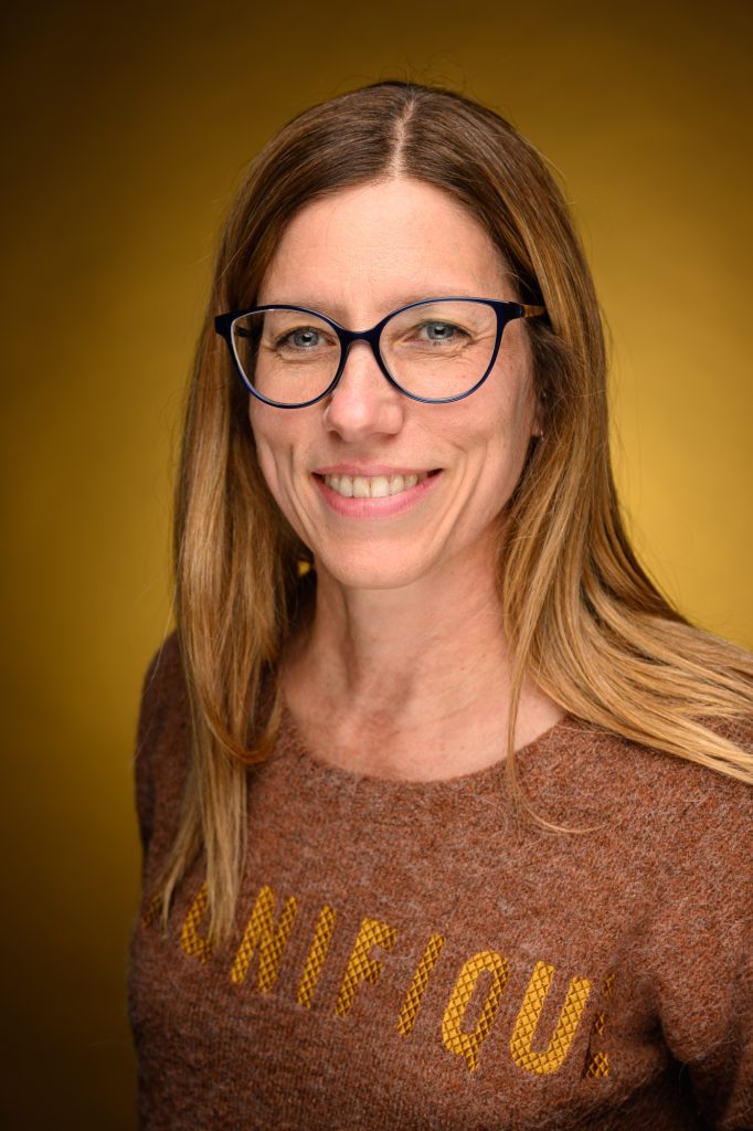
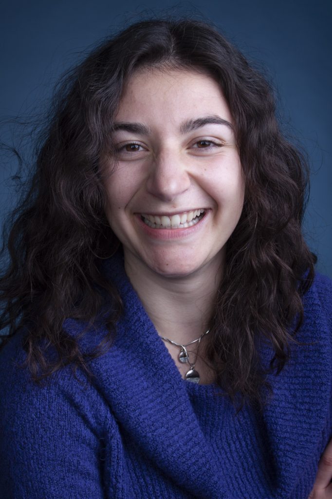
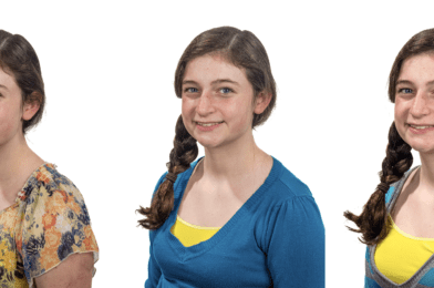
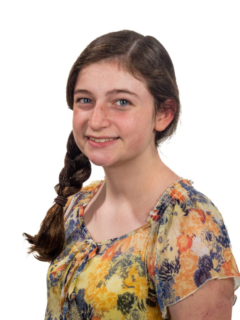
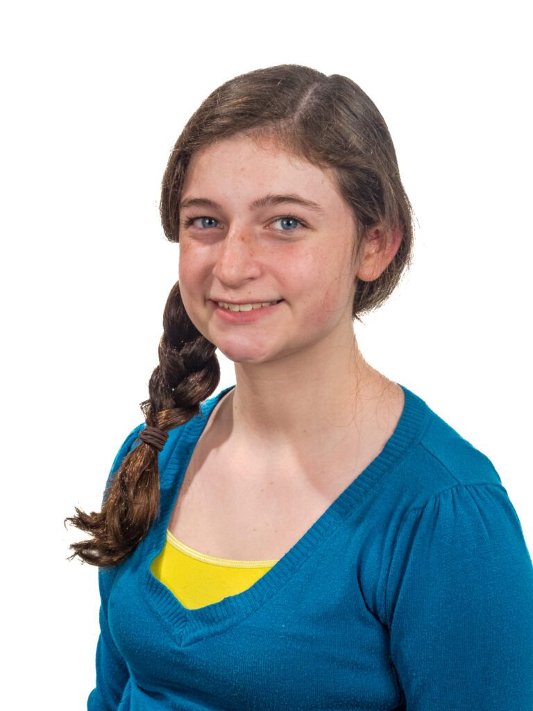
Take this first photo where I am lighting the person with one light on a grid. This classic Rembrandt Lighting gives you a nice triangle on the cheek.

All the photos here were taken during a class I taught in Hawaii on lighting.


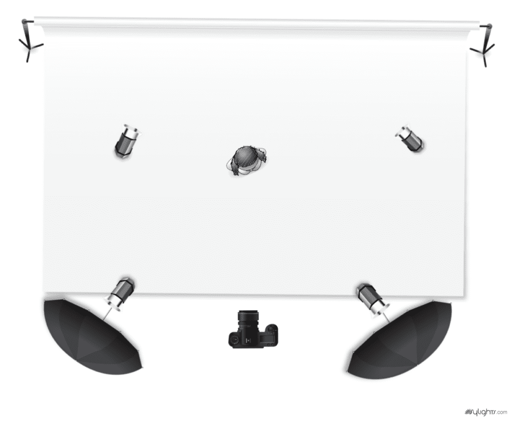
You can do this assignment yourself to understand how to understand ratio lighting. You need to first start with one light and then add other lights. Use this lighting diagram and the instructions below to duplicate this with your camera and off-camera flash.
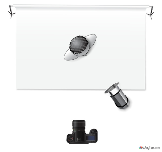
Description:
Rembrandt portrait using one grid light

Items:

  • Monobloc with ten or 20-degree grid
    • You may use any power setting you choose. Be sure your skin tone is adequately exposed and correct white balance.
  • White backdrop
    • You may use a black background as well. No other lights are to be used in this assignment.
  • Woman
    • Please get the best possible expression. For example, if they see a triangle on their cheek would be best. Be sure the triangle includes lighting their eye.
  • (D)SLR
    • Choose the lowest ISO setting for your camera. For example, use a portrait lens 85mm – 100mm, or if you don’t have a full frame, then 50mm will be OK.

The first place the above photo becomes a problem is in your newspaper. Especially when it runs in black and white, you see that everything without a light on it in the subject will be black in newspaper print.

To still get the excellent shape that takes place with an off-camera flash, you need to add fill light to help soften those harsh shadows so you can still see detail.

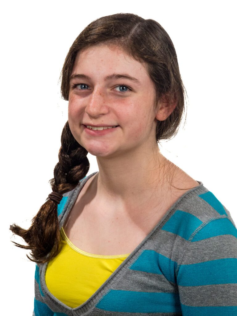
It would be best if you used the lighting diagram below to get the second photo here and follow the instructions. Then, shoot your subject with your camera and two lights.
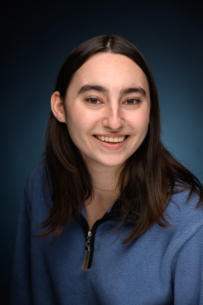
Description:
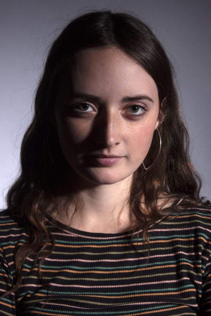
1:3 lighting ratio. This photo is classic lighting.

Items:

  • Woman
    • Your subject should have the main light lighting only part of the face, and the shadows should be just a little to show the 1:3 Ratio.
  • (D)SLR
    • Choose the lowest ISO. Use a portrait lens of 50mm if you don’t have a full-frame camera that can work. No more than 100mm.
  • Octobox
    • This is your fill light, and get a reading of this 2nd. Be sure it is 1/2 the power (1 f/stop less) than the leading light. After this is done, get a 3rd light reading of both lights, which will be the setting for the camera. It can be level with the eyes, but you may have to move up with glasses to avoid glare.
  • Softbox
    • This light is your leading light. Get a light reading with just this first. The light should be 45 degrees off the axis of the camera and 45 degrees above the subject’s eyes.
  • White backdrop
    • Keep the subject a few feet from the background, and do not use more lights to light it.

How to figure the Ratio

It would be best if you changed your f/stops into ratios. What I do is first understand that your leading light is putting out twice the light as your fill. You would think that this means you have a 2:1 ratio, but this isn’t the case.

The reason is you must figure not by what each light is putting out but by how much light is hitting the subject. 

Everywhere the leading light hits, so are your fill light from the camera’s angle. You then need to add the leading light and the fill for all those places, adding 2 + 1 = 3. The fill only lights the shadow, so there is no need for addition or subtraction.

On the subject, the brightest areas being lighted by the main and fill get three times the light compared to the shadows getting illuminated by just the fill, which we say is one amount of light.

This is what we call the 3:1 lighting ratio, and very printable in a newspaper.
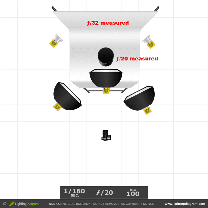
Adding a hair light

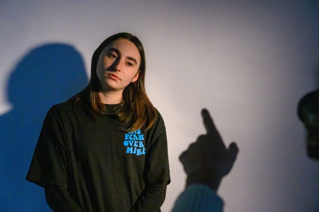
Go ahead and then shoot this third shot and add a hair light. Use the diagram below and play with the exposure of the hair light till you get something you like.
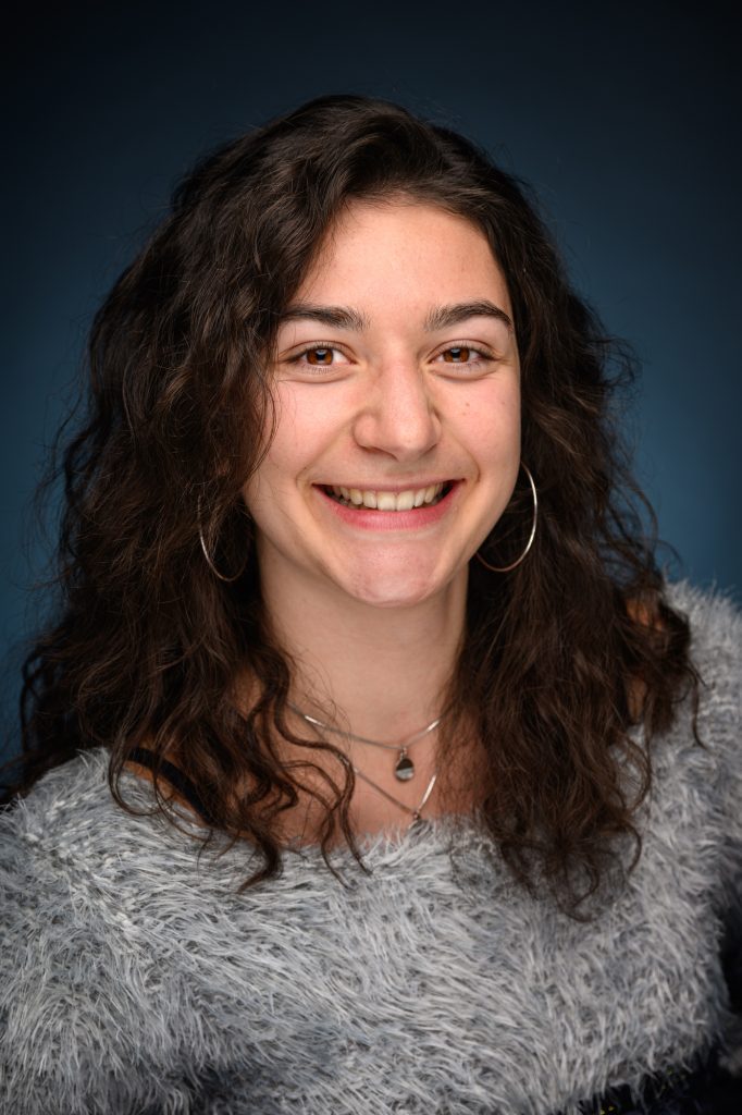
Description:
1:3 lighting ratio. This photo is classic lighting with hair light.

Items:

  • Woman
  • Your subject should have the main light lighting only part of the face, and the shadows should be just a little to show the 1:3 Ratio.
  • Monobloc with grid on boom
  • With dark hair, start at the same f/stop as the main up to about 1 or 2 stops more. With bald or light hair, be careful using hair light. Sometimes better not to use one.
  • (D)SLR
  • Choose the lowest ISO. Use a portrait lens of 50mm if you don’t have a full-frame camera can work. No more than 100mm.
  • Octobox
  • This is your fill light, and get a reading of this 2nd. Be sure it is 1/2 the power (1 f/stop less) than the leading light. After this is done, get a 3rd light reading of both lights, which will be the setting for the camera. It can be level with the eyes, but you may have to move up with glasses to avoid glare.
  • Softbox
  • This light is your leading light. Get a light reading with just this first. The light should be 45 degrees off the axis of the camera and 45 degrees above the subject’s eyes.
  • White backdrop
  • Keep the subject a few feet from the background, and do not use more lights to light it.

Background Light

You can add color to your background by just putting a colored gel over a light and pointing it to the background. It would be best if, first, you were sure your other lights were not lighting the background. For the photos below, we used the first lighting setup with one morning with a grid and then added the background light.

Using a white background, be sure your value on the background from the background light is -2 stops as compared to the leading light. This will give you the same color as your gel. Suppose you want a darker color, then even less light. If you prefer a lighting color, add more light.

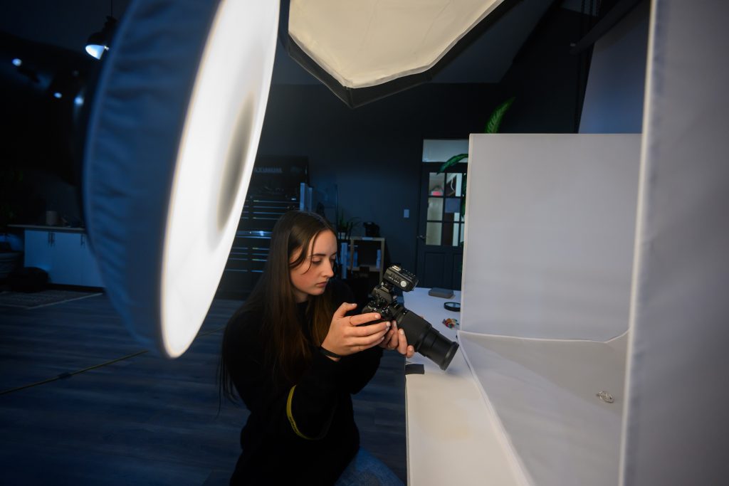
Here is a photo of some students having fun with their assignments in Kona, Hawaii.