

Photo #1
I wanted to walk you through a few photos and let you see what makes the images work.
In photo #1, I think a few things help make this photo work. Here is a quick bullet list of things that help make this work.
- Rule-of-thirds—The man gesturing is in the right top third
- Good use of light that is shining onto their faces, and it is brightest where the two men are in the photo
- Gesture—The man’s gesture helps you know he is talking to the man beside him. Also, the little girl’s finger under her nose shows possible sniffles. The little girl’s eyes also redirect you back to the man gesturing
- Shallow Depth-of-Field [DOF]—As you return to the picture, the photo drops off in sharpness. Shallow Depth-of-field helps keep your attention on the front of the man

I like this image of the ladies talking. Who can’t resist good “Window Light?” The rule of thirds also works here. Shallow DOF keeps your attention on the lady listening. Catchlights in the eyes give life to her expressions. The hands communicate tension. I feel like she is dealing with some stress due to the position of her hands. With her head leaning on the wall, I also feel like she is relaxed and comfortable with this other lady. The other lady is slightly taller, and her body position and the lady listening to her communicate some authority.
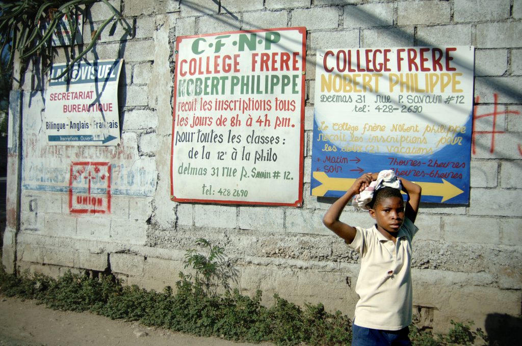
Street photography involves many grab shots. Here, the wall helps communicate the neighborhood where this young boy lives. The signage tells you that education is essential. The little boy is relaxed in his posture.
The photographer has a lot of space behind the boy and very little in front. The area helps create tension in that the future isn’t as hopeful. The boy’s expression questions and wonders who this photographer is, thus communicating a little pressure on the audience. The color palette is simple, yet the colors convey the Caribbean.
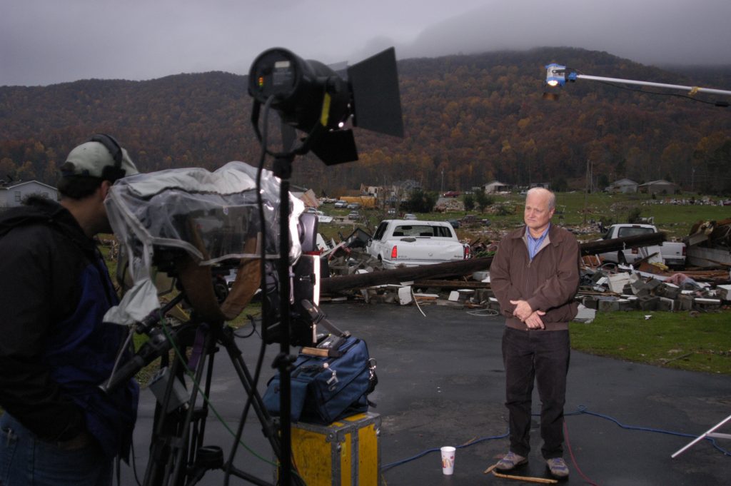
Photo #4 is of NBC news reporter Robert Hager covering a tornado disaster. The DOF is increased to ensure the viewer looks toward the debris in the background. Hagar is waiting to go on air to discuss the situation.
Here, the elements of the videographer and his gear help tell the story and, in essence, frame Robert Hager and the destruction.
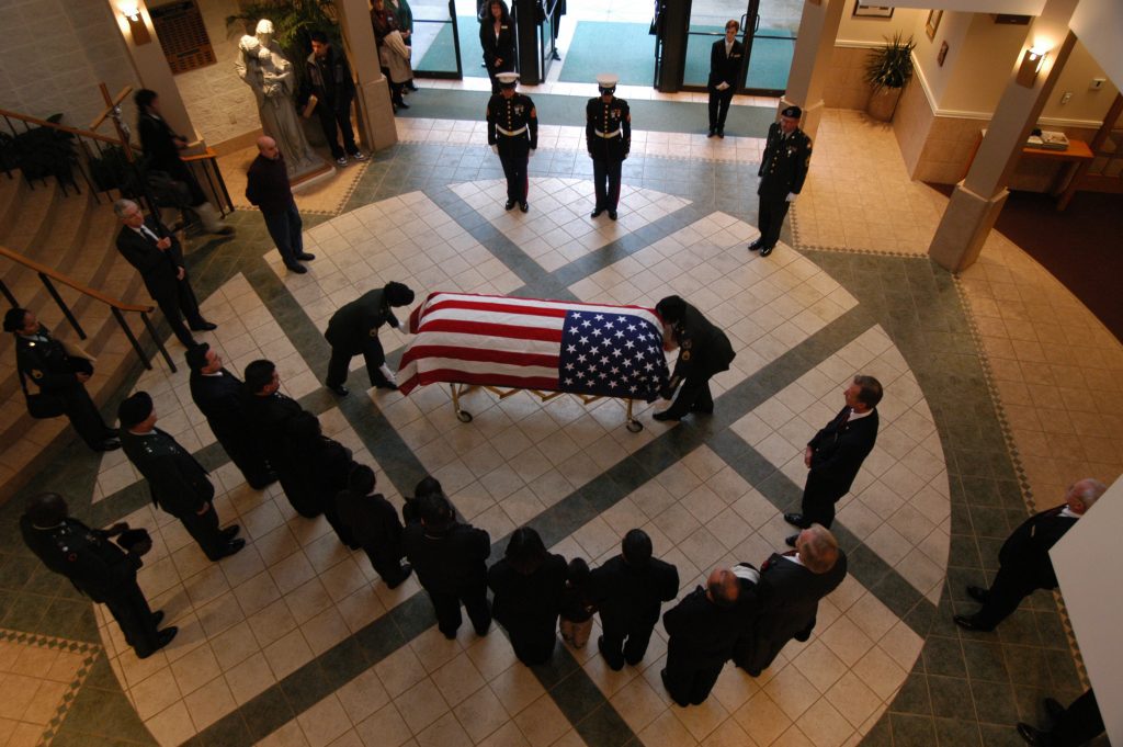
In photo #5, the subject is dead center. Please pardon how this sounds, but this is why I put the issue in the center. You usually want to avoid the dead center, but it helps create even more tension here. The edges of the photo are trying to contain everyone in the picture. The lack of color around the image and then the American flag in the center helps to make it pop and draw the audience’s attention.

Photo #6 uses color to help create interest and set the mood. Again, the light is off to the side, allowing the viewer to see the design of the lamp post.

Using the rule of thirds helped with the composition in photo #7. Also, using a shallow DOF, the eye goes to the sharpest part of the photo, which is the guy’s face. Here, the expression of the man and the man he is looking at keeps you returning to the apparent friendship between the two guys.
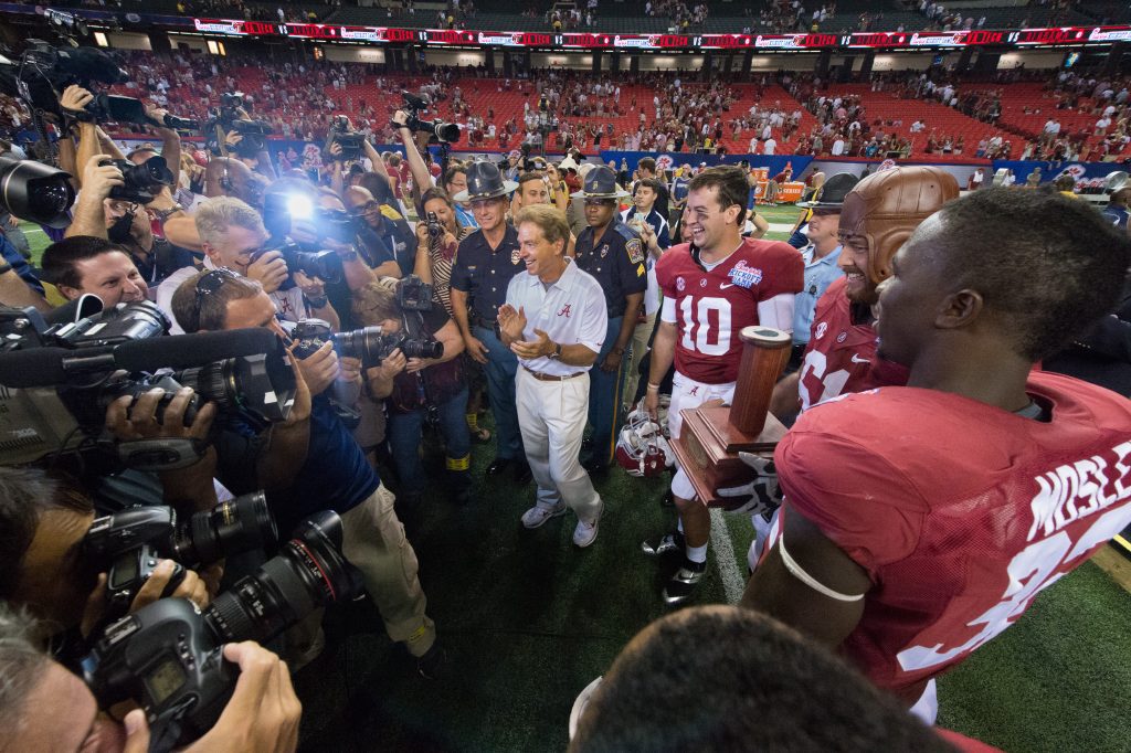
The light on the video camera in photo #8 helps start the eye looking and following the morning to the subject. Also, all the cameras on the left enable the eye to direct to the right and the guys holding the trophy. Here, the photographer has moved as close as possible and is trying to contain everything in the frame.
Can you break down each of your photos? Today, study your pictures and those that catch your attention. Then, break them down so you can use some of those techniques later in your photos.