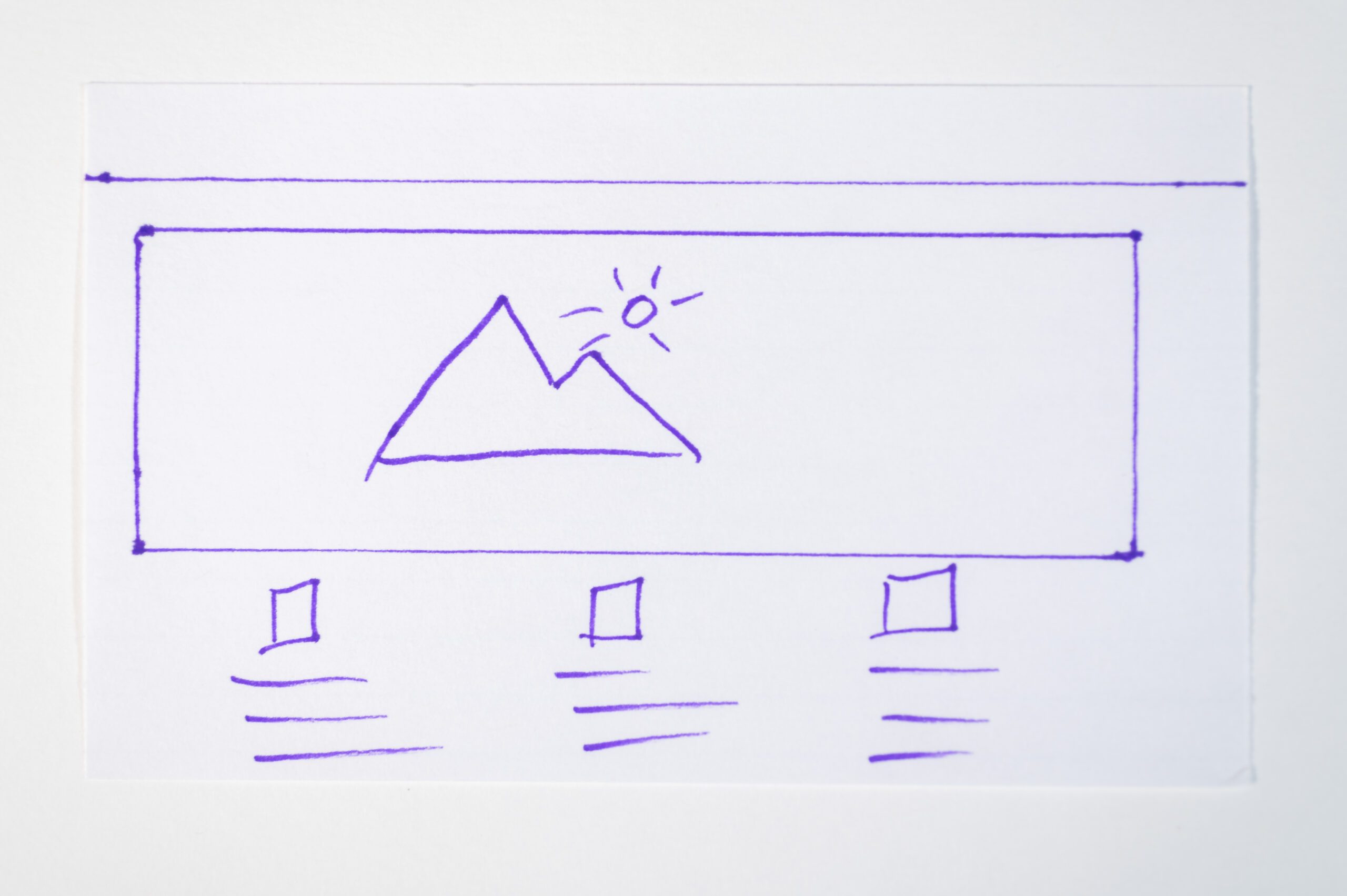
Your greatest friend when creating a website is the 3″x5″ index cards.
Your first page will have these essential elements.
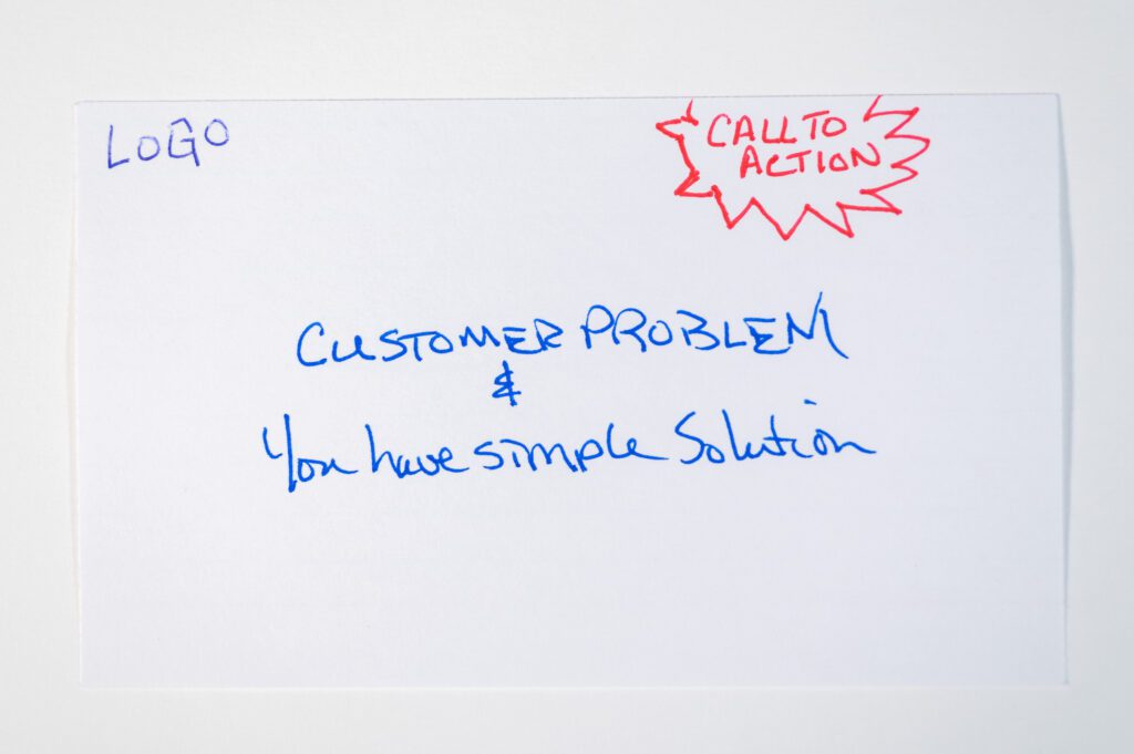
You will have the name/logo for your business. You will state the problem that the customer has and your solution. The best place to put a call to action BUTTON, which will be a link to another page, is in the upper right-hand corner. This should be on every landing page you create. Please don’t make people look for it.
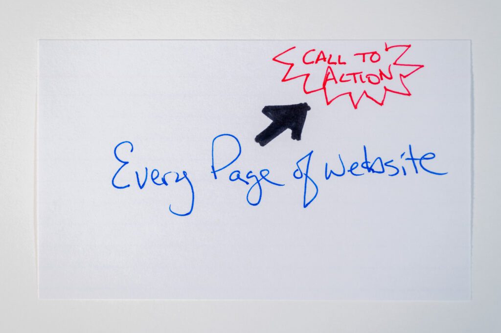
The call to action is always a way to contact you and get the ball rolling on the problem they need you to help solve.
Here are some descriptions I found on some websites:
- A unique law practice led by Dr. _____, attorney and board-certified Neurological Surgeon.
- Telling your story through classic, joyful photography & heartfelt films
- Atlanta Lifestyle Family Photographer
Now compare those to some of these:
- We provide back-end support so you save time.
- Are you wasting time with administrative work?
- Training IT professionals to become excellent at service and support.
Can you see the difference? That first set is pretty vague regarding the client’s problem and what they are offering. Use this tagline to separate yourself from your competition.
The Big Secret
Believe it or not, even if every business in your category provides 24/7 service, if you are the only one with that on your website, particularly in the tagline, you will get more business when that is what someone needs. They need you at some odd hour of the day. They will call you first because you are open.
So, where is a great place to see good taglines? One place is newspapers and magazine article headers and photo captions.
Another place is to look at Social Media and those clickbait ads.
Clickbait works. Whether we like it or not.
People hate the idea of clickbait. But they are appropriately used – for good! – it’s one of the most powerful ways to grab attention in this increasingly saturated world.
The ‘cliffhanger’ or curiosity gap is one of the most potent headline formulas. It uses pattern interruption to shock or surprise us, forcing us to click to uncover the reason.
A good tagline for your main page is about getting at the heart of the issue for the customer.
This may be enough for them to go and click on the call to action, which is a Button/Link to a contact page.
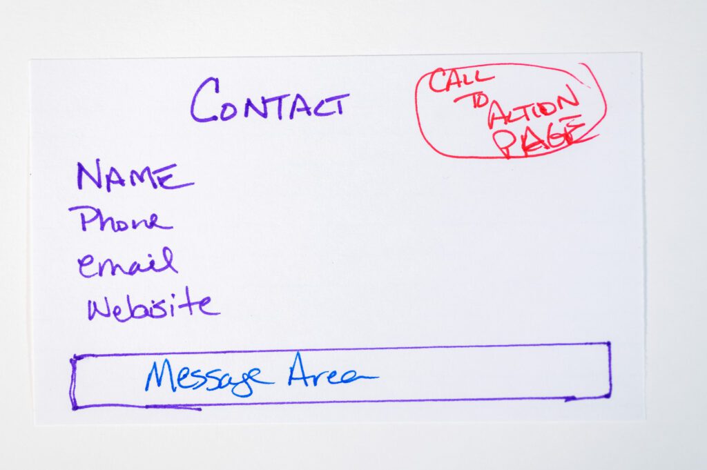
You may want to gather more information, but remember too much, and you will turn them off. They understand you need the information to reach them, but do you need all that information that would be great to have but not necessary to start the ball rolling?
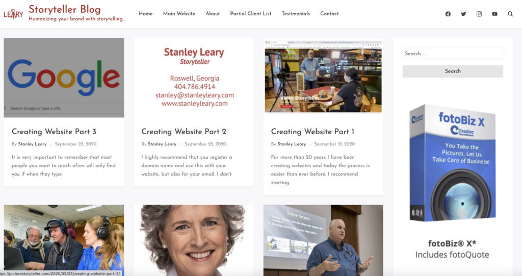
On this blog website, I have at the top what I refer to as the navigation tools for the user. Suppose they click on my logo that takes them to the home page. Since some people are text-oriented, I also have a Home link that is text. I also have links to:
- About – Bio
- Partial Client List
- Testimonials
- Contact
- Social Media
- Vimeo
- Search – to search for topics in my blog
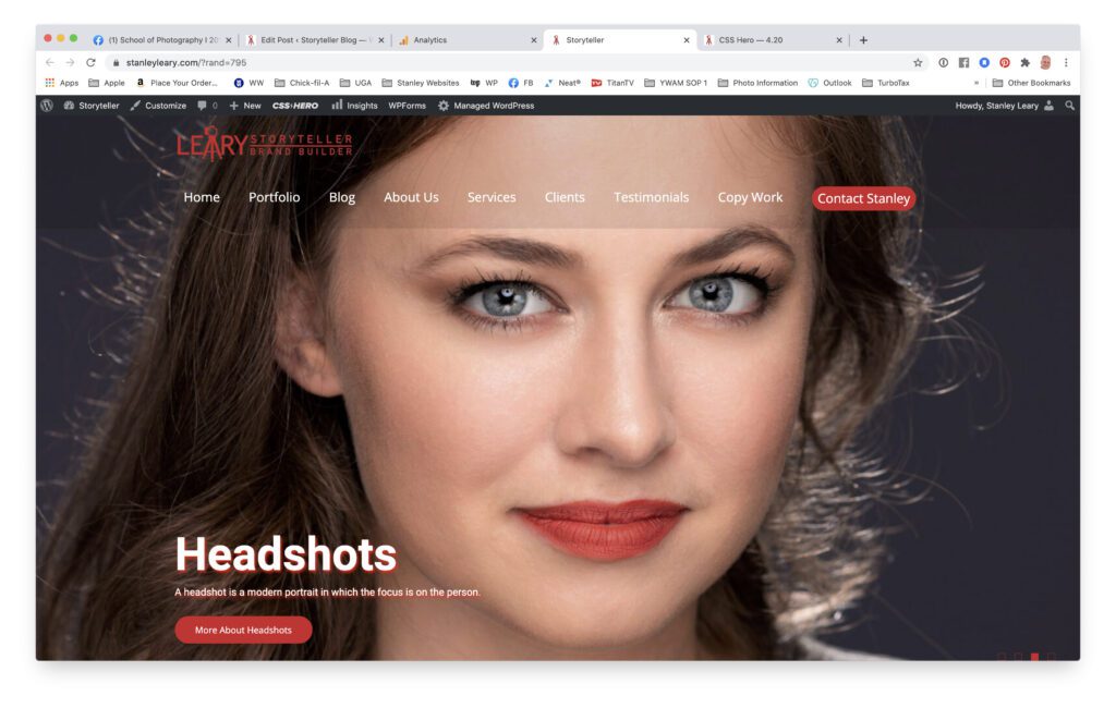
My main website has similar navigation at the top.
I have also created a rotating front page that addresses four main areas where I get hired.
- Video
- Corporate
- Headshots
- Humanitarian
I am now writing the code to make the contact link in the navigation bar have a colored box around it, as I have on each rotating page where I have a red box at the bottom to learn more about those categories.
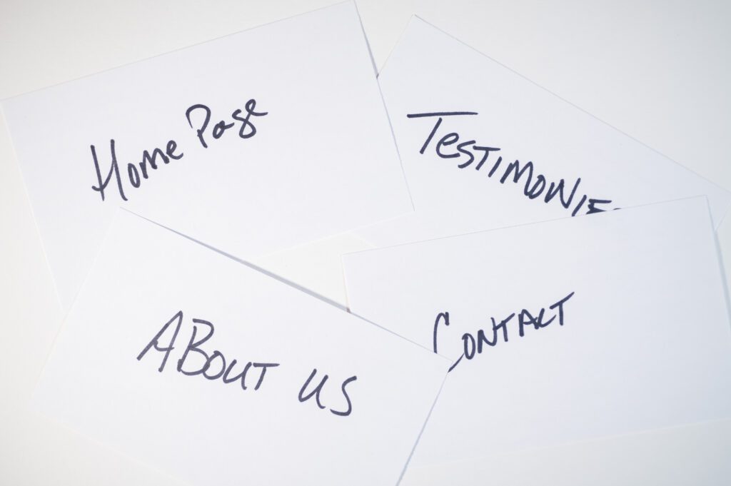
I highly recommend using the 3″x5″ cards. Now while you can have a website page that you scroll down through, be sure your main page and all landing pages have the pertinent content, as we like to say, “Above The Fold.”
In the early days of publishing, “Above The Fold” was a term used for content that appeared on the top half of the front page of a newspaper. Today, the fold no longer refers to an actual fold in a newspaper but the bottom of a browser window, or approximately 600 pixels from the top of the page.
Every Page Tips
- Remember to be sure the title of each page clearly defines what it is about.
- Have good navigation.
- Always have text that addresses the customer’s issues and how you will solve them.
- Call to Action – except on the one page that is the contact page
Lead with those items and then give them supporting material as to why you are the expert on their issues.
