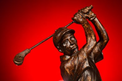
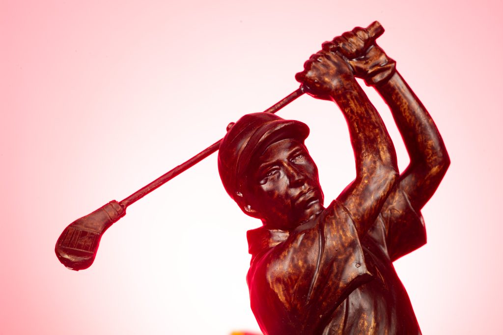
How do you get the photo on top versus the one below? Read on. Lighting everything and using a white background are what you typically get at the bottom. TIP: to get a clean white background, be sure the background is 1 stop greater than the subject. Also, slightly angle the background so it isn’t perpendicular to the camera, or you will get a light flare caused by the background. (Figure 1)
I like to light parts of a scene rather than all of it. Lighting everything, as in the photo above, gives a sterile or even a feeling of the afterlife and living in heaven. If I want that look, I might use this lighting setup. The other advantage of lighting the subject is that you can move and spin, and the light will look the same. You don’t worry about shadows in the wrong places.
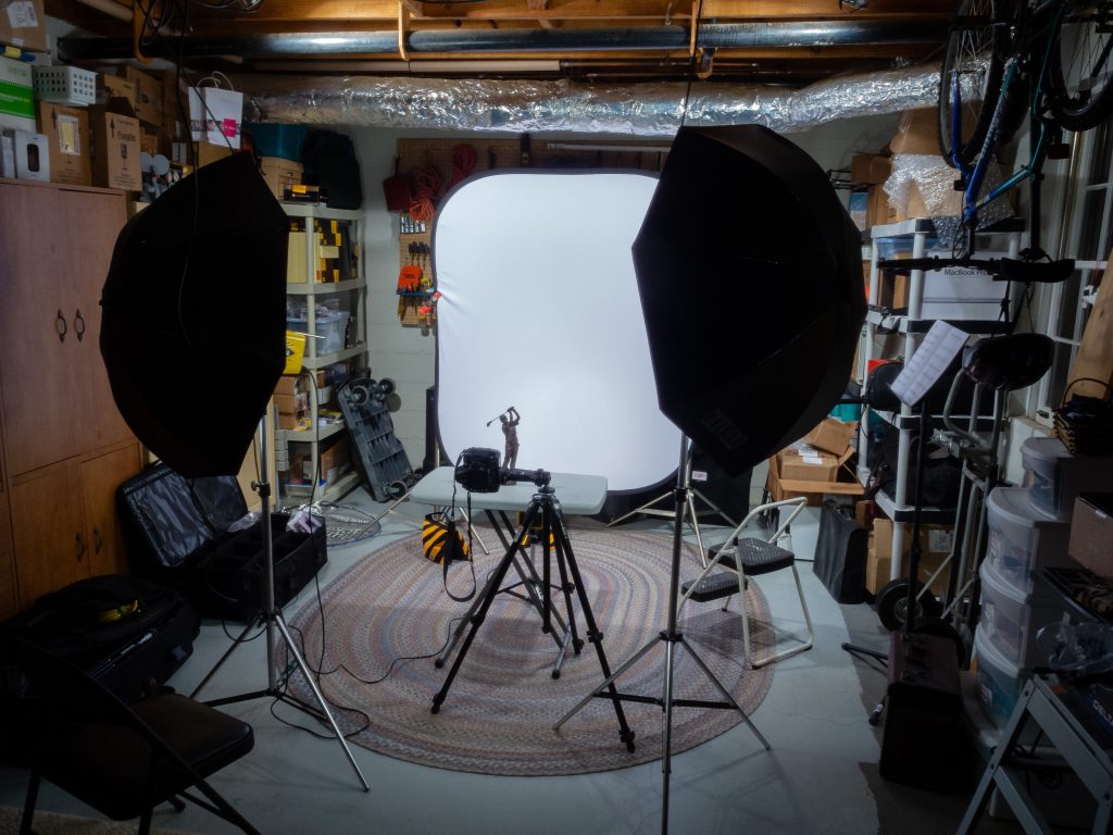
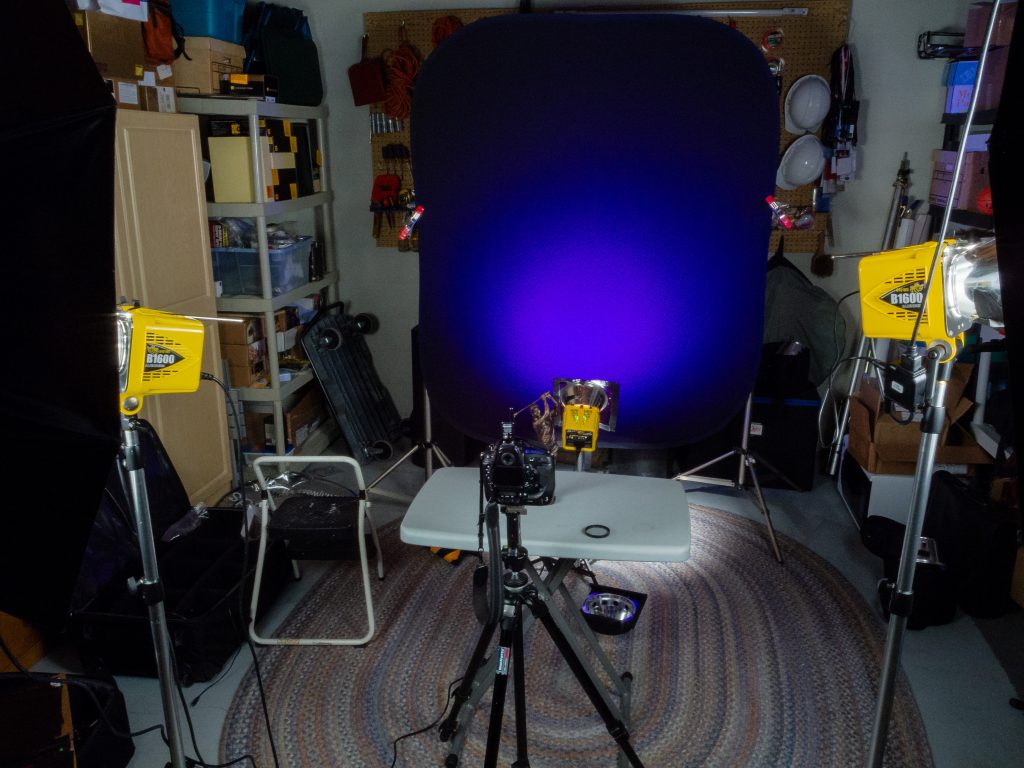
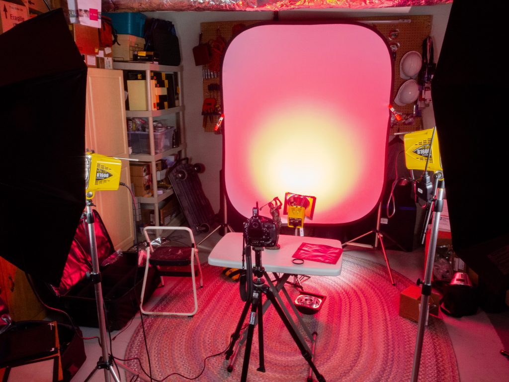
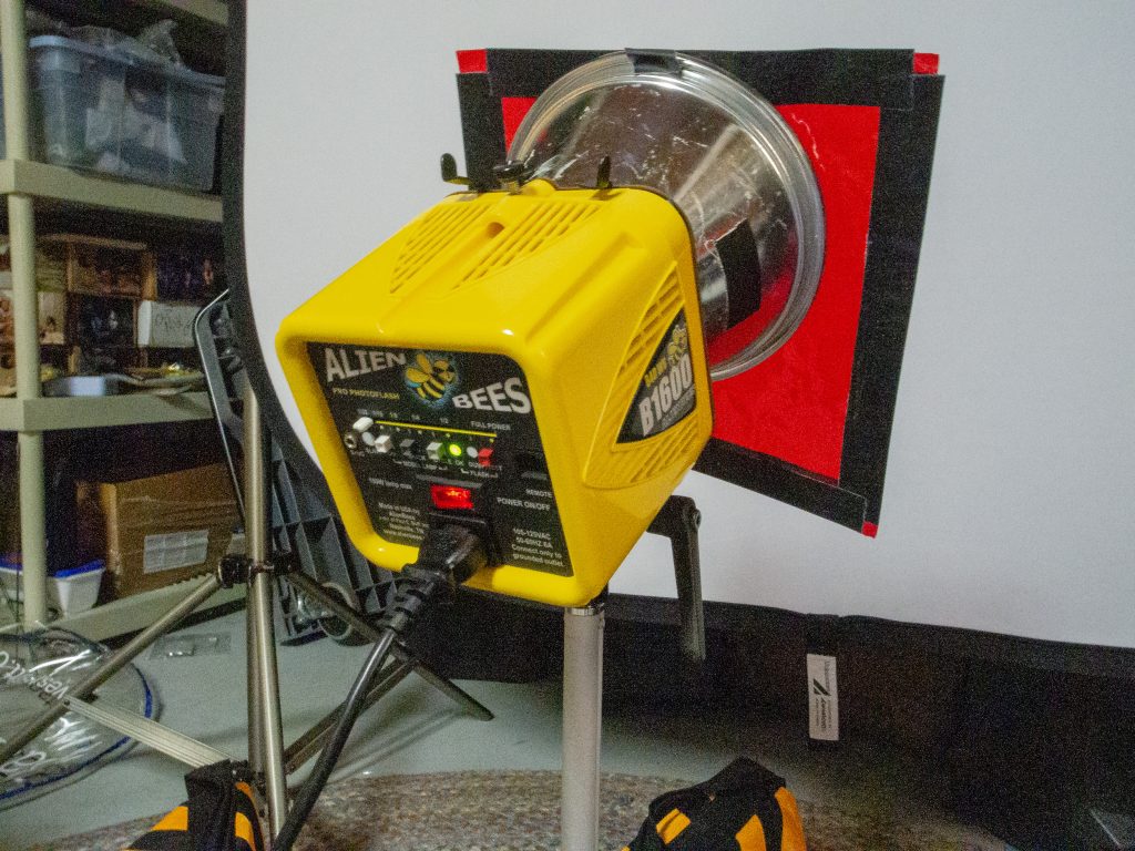
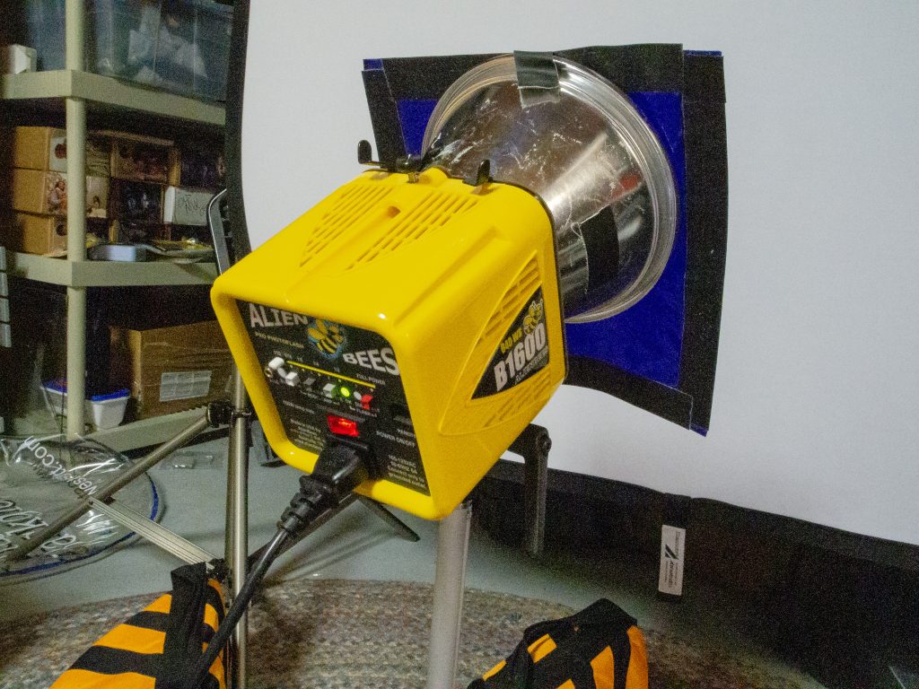
Figure 1 was done using this setup. Three lights are in the background and two on umbrellas lighting the statue. (Figure 2)Using the two umbrellas like in Figure 1, I now just used one light on the background, but now with a blue gel. Because it takes very little light to affect the white background, the two lights on the subject are spilling over to the background and washing out the blue color. (Figure 3)This is the lighting setup for figure 3. (Figure 4)By changing the background from a white background to a black background and everything else the same as in Figure 3, the blue pops. The reason is the black sucks light as opposed to reflecting light like the white background. (Figure 5)
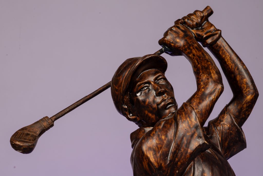
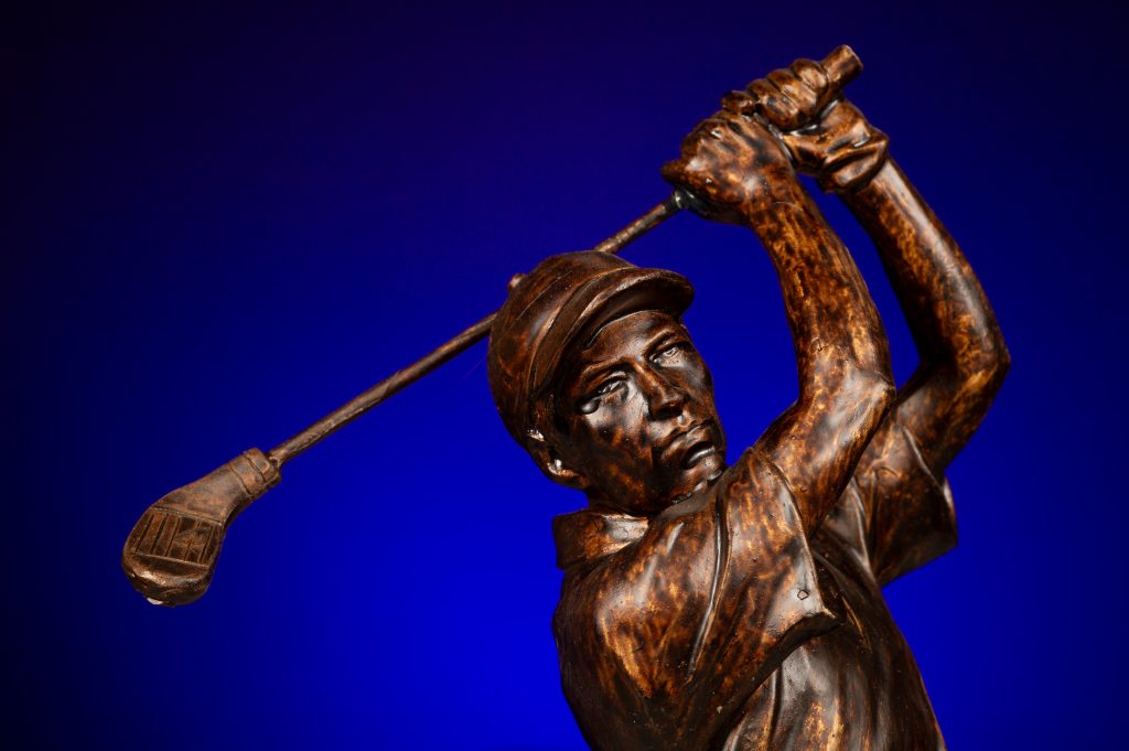
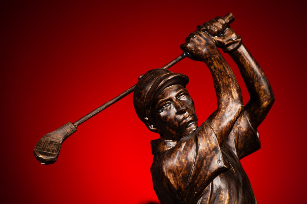
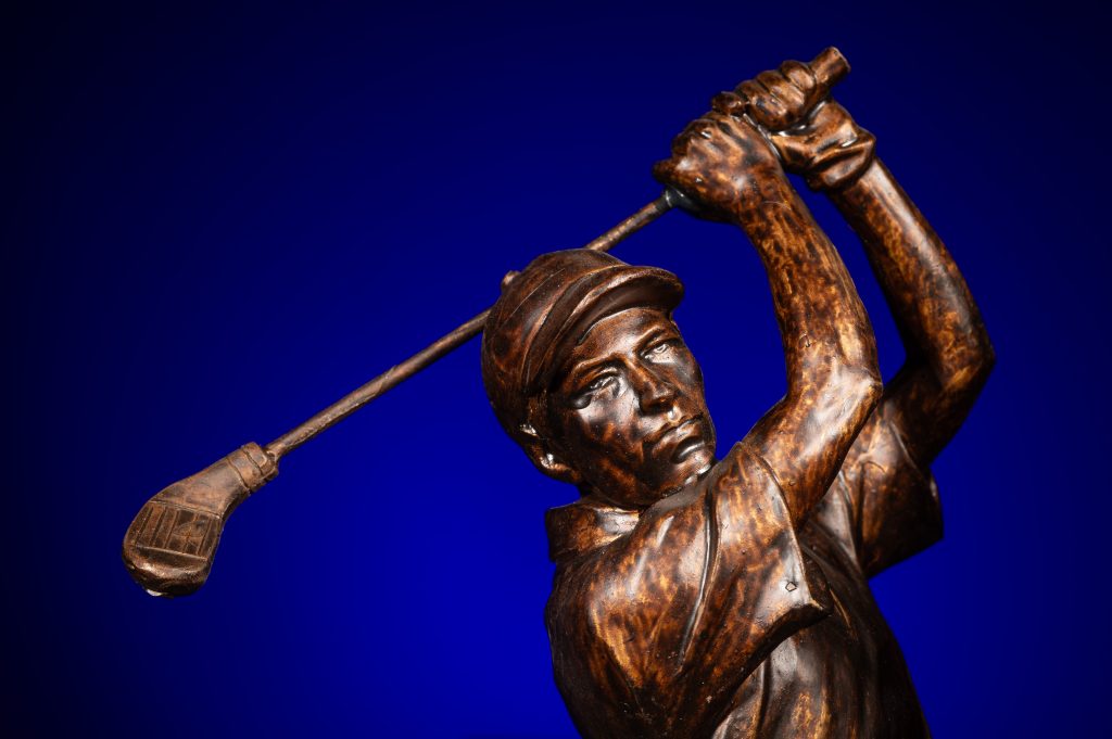
I like to have more drama as in this photo of the golfer with the blue background fading out to black around the edges.
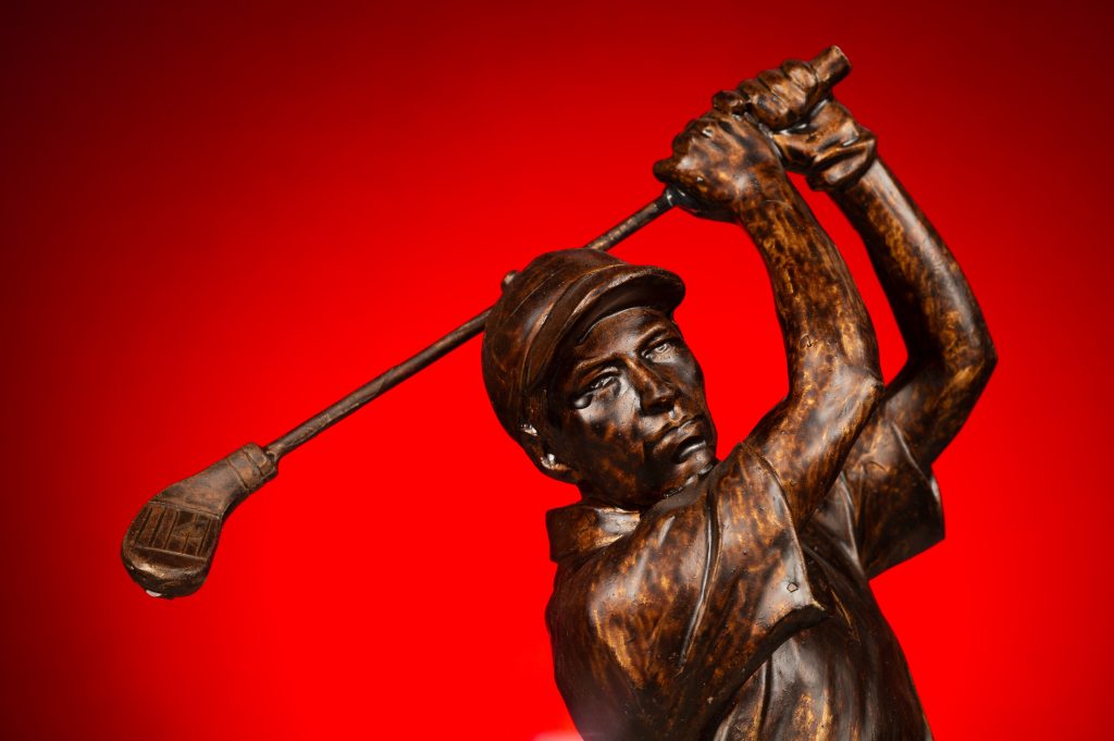
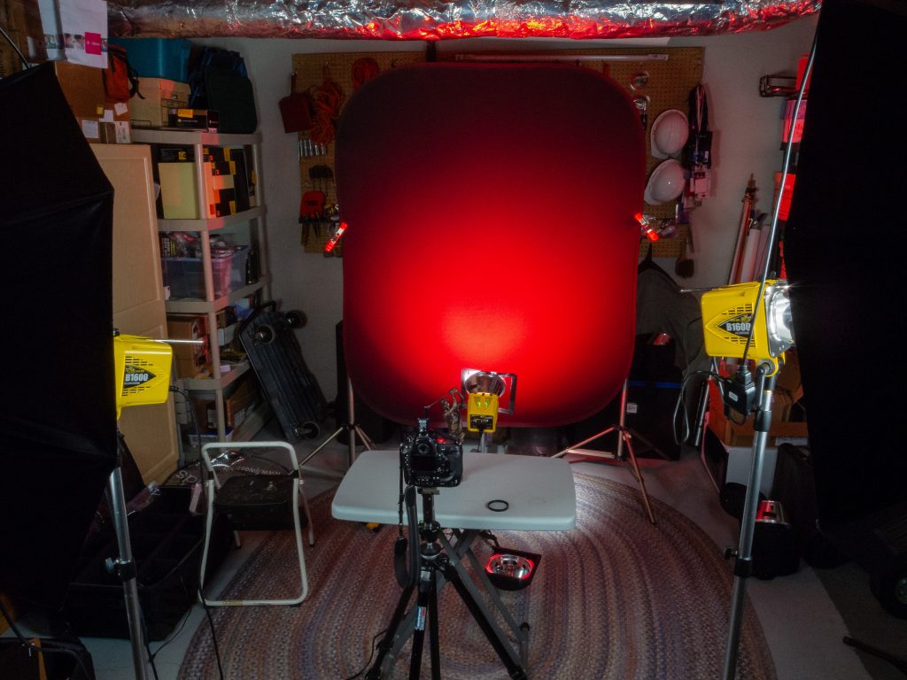
As you can see, everything is the same. There are two changes: 1) White to Black Background and 2) 4 times the light through the blue gel. Just remember to get the gel to look the same color as you see it, it must be 2-stops brighter on the background than the light on the subject, assuming you expose for the subject. (Figure 6)Just changing the gel and leaving everything else the same, I can now decide which color I like best. (Figure 7)Here is what the setup looks like in figure 7. (figure 8)Changing back to the white background, I again get contamination from the front lights, which goes pink instead of red. (Figure 9)
This photo is too pink and there is pink light on the subject. This happens when you are not controlling your lights. Learn to control the lights by not lighting everything up like you do with umbrellas.
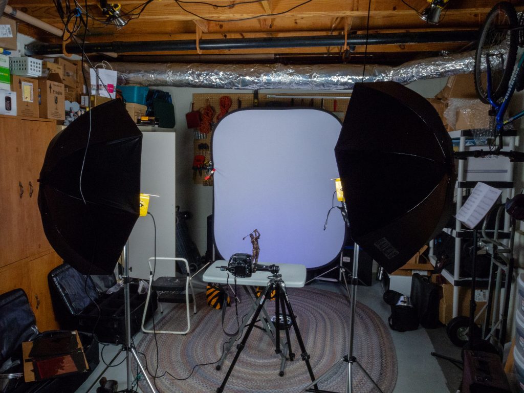
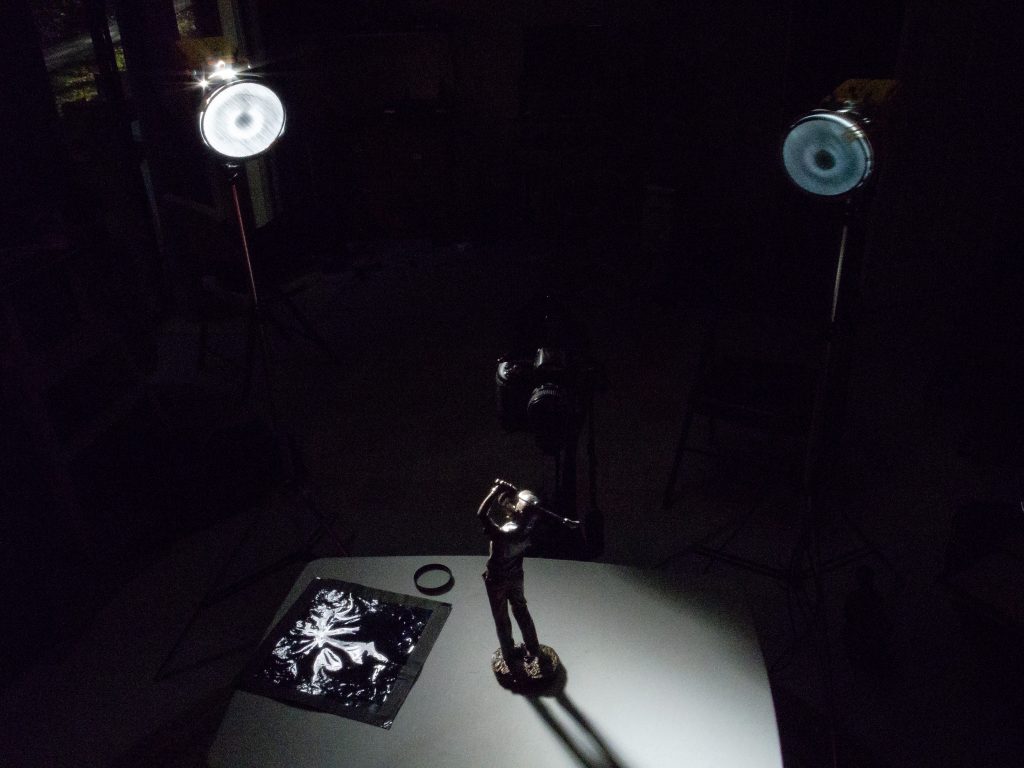
Figure 9 setup. (Figure 10)This is shot on the white background. I changed the setting on the background to -2 stops under the setting of the subject. I removed the umbrellas and put 10 degree grids on the lights. (Figure 11)Here is the setup for figure 11. Everything goes black except for where the light is hitting. This is how you can control the light and not light the whole room. (Figure 12)
You don’t need to use gels to get a dramatic effect, but the more you learn not to light everything, but just parts of the photo, is when you can direct the audience’s attention in the photo. There is more than just lighting parts of the image; you can ratio the light throughout the photo and have some parts that are not black but slightly darker than the subject. This way you still see those other aspects of the scene, but they are secondary to the main subject. It is like having two or three sentences in a paragraph, and you direct the reader to who the main subject is and the supporting roles.
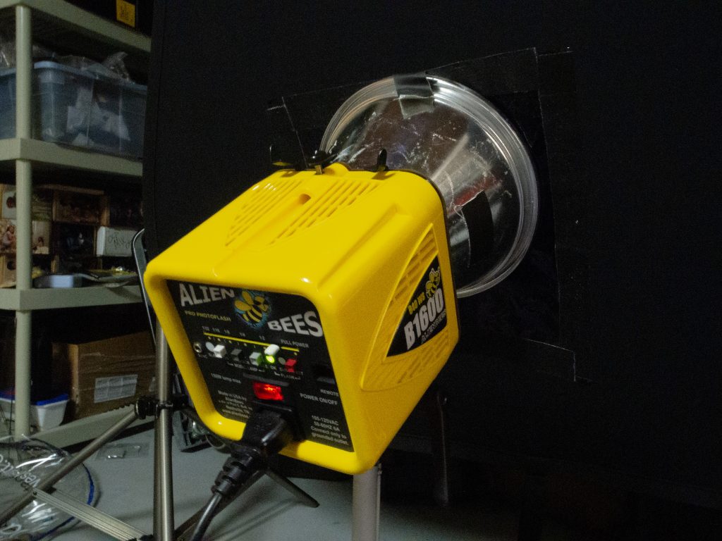
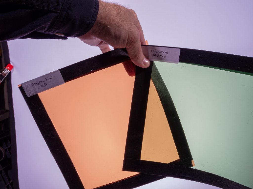
Here is the light powered down for the white background for figure 11. (Figure 13)Just change the red gel to blue, leaving everything as shown in figure 11. (Figure 14)All I changed is the gel to blue from red to get figure 14. (Figure 15)Here you can see I have the power way up, actually 2 stops greater than the subject. This is for figure 5 photo. (Figure 16)A tip to make your gels last longer. Cut them to the size you use for your strobes, take gaffers tape, and wrap the edges. When you use them on the lights, turn the modeling light off after checking them with the modeling light. They will last longer and not melt or catch fire. (Figure 17)Some of my gels I have labeled. Here I have the gel on the left labeled 3200 Kelvin and 81B. This lets me know I can put this over a strobe to match incandescent light bulbs. The one on the right is 30G, letting me know that I can balance my strobes to color match the fluorescent for many fluorescent lights. (Figure 18)
If you like this image I will walk you through the steps to get here. (Figure 1)
I started here and got the exposure to pretty close to the tones in the carving. (Figure 2)
By just adding one light off to the right I got the next image. (Figure 3)
I liked the result, but wanted a little more color in the bowl than I have in this photo. (Figure 4)
Here you can see that the statue is back lit naturally, but can see the first light to the right that I added and the second fill light I added just next to the lens on the left. (Figure 5)
The reason I chose a dark object to light is because it is much more difficult, but also shows you how the light dramatically improves the object. It works similarly with a lighter object, but the results are harder to see sometimes.
I had the object back lighted to be sure you understand the light I am adding truly helps. This is like having people looking at the camera and it is the best angle, but the sun is behind them. By just turning on the flash you get a better result, but there is little to show the shape of the object as compared to getting the flash off the camera.
One flash off camera give nice shaping to the face. (Figure 6)
By adding a fill light just beside the lens on the left, we help not only fill in the shadow side, the photo transforms from an almost black and white look to a color feel. (Figure 7)
Now for all the photos above the exposure compensation was used at -2 stops under what the auto exposure was reading. I had my flashes under exposed or 0. The reason is the camera wants to make the statue a neutral gray when it is actually darker. To compensate I under exposed to fool the meter to get what was correct.
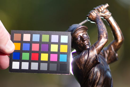
I am using the Mini ColorChecker by x-rite so you can see the color as shot in each situation with this series. This will not just help you see proper exposure, but the color space for each photo. (figure 7)
I wanted you to see you can just use a reflector to help improve the photo, but please pay attention to not just the shadows being improved, pay attention to the colors. (Figure 8)
Shot with fill and you can see not just exposure but color temperature will be different with reflector or flash. (figure 9)
Here with one flash to the right of the camera and one behind the statue you can see ho it improves the tones and the color space. This is why I prefer using strobes over reflectors alone for portraits. Another major benefit with strobes over a reflector, is the reflector gives a constant light source which will cause most folks to squint. (Figure 10)
This was the setup for Figure 11. By the way, I shot this with my Nikon P7000 with the flash on for fill. (Figure 12)
I thought the light behind the golfer was a little distracting, so I moved it to the left out of the photo 180 degrees opposite the main light to the right. The Nikon TTL system is balancing the background -2 Stops under to the flashes which are normal of 0 setting. (Figure 13)
This is the setup for Figure 13. Again I shot this on the Nikon P7000 with the pop up fill flash to help the statue and the camera gear to have some definition. (Figure 14)
Practice lighting with some objects that are dark or even black. See if you can change the mood of the situation by just positioning the lights in different places. Maybe you use the X-Rite Mini ColorChecker to see if you are setting the camera’s white balance correctly to get the best color. If you shoot in Raw you can correct this later, but if you shoot in JPEG you can change it later, but the results are noticeably poor.
Cookie Consent
We use cookies to improve your experience on our site. By using our site, you consent to cookies.