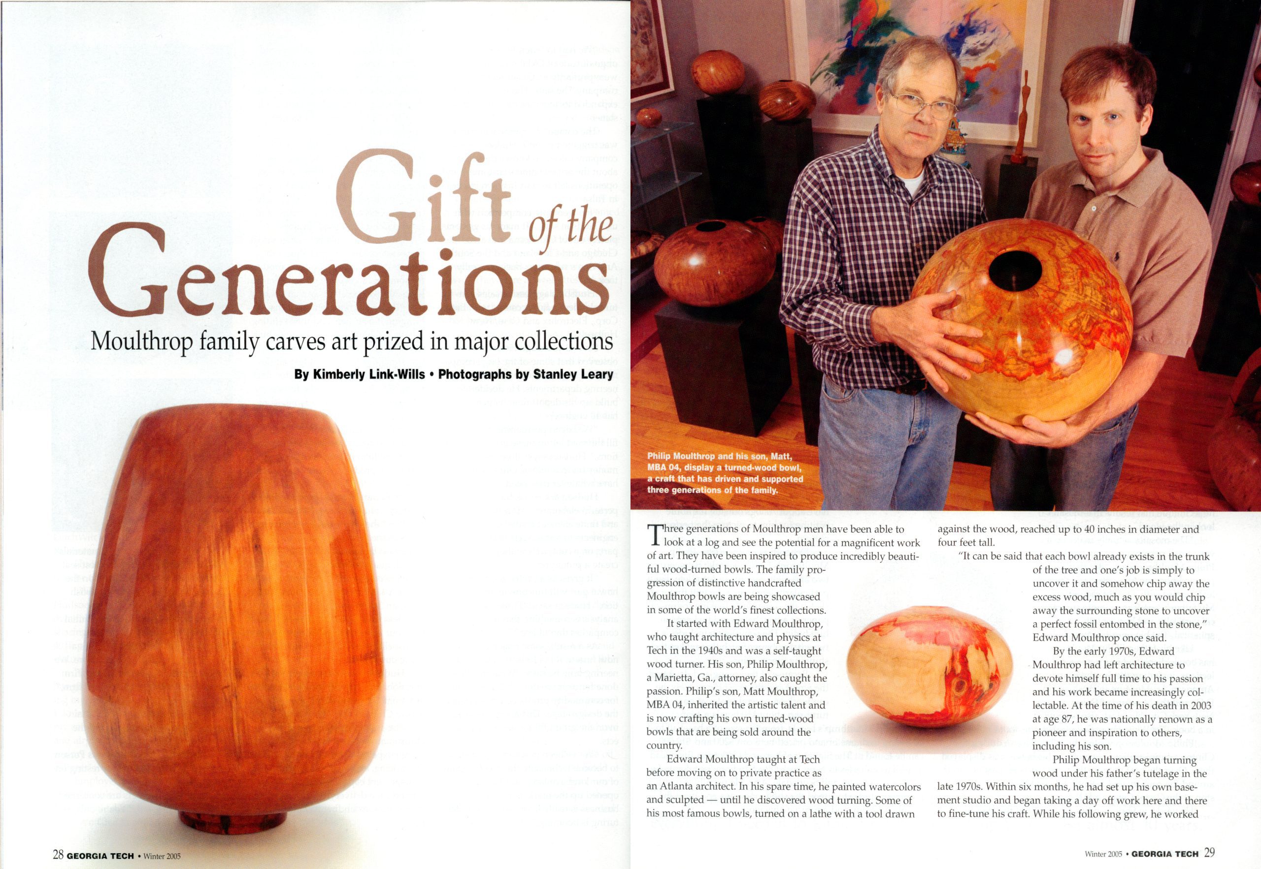
When you shoot for print, especially a magazine, you will compose some photos for the cover. As a result, you leave a little more space than you would have if you had not been trying to make room for the text that needs to be on the cover.
Most editorial photographers benefit financially if the photo runs bigger and for how many images they use in the printed piece. Getting a double-truck [two total pages–side by side] also will give you more money. Here you have to consider the gutter, where the two pages are divided.
Sometimes they use one photo that bleeds off the pages or sometimes a grouping like here above. However, most designers are aware of the gutter and minimize this effect on the image.
Knowing you are shooting a photo story, most pros will do all they can to make the images so good that the editor feels the account must be on the cover and get extra pages. More variety helps the storytelling, and the photographer benefits from a more extensive paycheck.
The designers used to joke with my mentor, Don Rutledge; they thought he had templates inside the viewfinder to help him help them with the layout. But, really so many variables in situations that for any position, he usually had a cover shot, a double truck, some variation of the double truck, and then some tighter shots for impact.
Computer
Today the most likely place your photos will be on the web. The web is a horizontal space, and the general rule of photography is to fill the camera’s frame and watch the corners. The flat area also applies to your photo when filling the hole the designers are working with on the computer screen.
Here is how a vertical shot will look in the space for a designer. The horizontal layout for the desktop is the space it would fit within a video. The video format is about 16:9 in proportion.
Now the photo of the man here is the full 3:2 frame from the camera placed inside the 16:9 format with no cropping. While this is much better, the designer would prefer to fill their space, and so does the video editor.
I suggest shooting a little looser, giving some room for cropping. Some photographers will even put guides over the LCD screens to help them with their framing.
If you want to grow your business, be the guy that not only shoots for the use that the project is intended for but to meets other uses. Thinking beyond the immediate need is excellent stewardship because you can show the client that they can now use your photos for many different things, from brochures, newsletters, displays, PowerPoint, websites, and more.
Besides understanding the proportions, you need to consider what the audience uses to view your work. Knowing your audience is where your demographics can help you plan the coverage better.
You need to consider photos in a video on a website. Now, if your audience is mainly going to the web through a desktop or even laptop, you would shoot this differently than if they are using a Smartphone.
Shoot tighter if the experience is on a mobile device like an iPad or iPhone. For example, a panoramic shot with a person in the corner doesn’t read well on a 3″ screen. A smaller screen is where intimate photos of faces and objects are better for the space.
Think of how you tell time. Be sure the face of the clock fits the space to be able to tell the time.
As you can see, the photo of the watch makes it easy to tell the time.
As you can see in this photo, the watch and clock are about the same size. So if you want to see what time it is, get closer than this photo. In a video playing full speed on an iPhone, this image would lose its ability to communicate.
Are you asking the client, “What is the end use of the photos?” If not, you need to do this, and then you need to plan to be sure your photos make the best use of the space.


