Caption: Available Light only (Nikon D3S, ISO 12,800, f/5.6, 1/40, 28-300mm)
Hey Stanley, can you back up and explain this Ambient Light and under-stops thing you mentioned in that last post?
A few people wrote to me asking similar questions. So, let’s delve into ambient light and under—or over-exposure with a flash.
 |
| Without a flash point, the camera is at the subject. My camera is set for Matrix Metering, and Aperture Priority gives me a reading of f/3.5 with a 1/10 shutter speed and ISO of 200. FYI, this is not the setting in the above photo; this shows you where to find the reading on the camera. |
Step One: Get An Ambient Reading
It would be best to have a starting place, which will be your base exposure. Everything else will relate to this exposure. I, too, have a picture of the top of my Nikon D3S with a 28-300mm Nikkor lens. I just pointed across the room for this example. With SO 200, I have an f/3.5 aperture at a 1/10 shutter speed. This is my Ambient Reading with no flash.
Step Two: Use your Nikon SB900
You can use whatever hotshoe flash your manufacturer needs, but it must be a TTL flash, or this will not work as efficiently.
Step Three: Slow or Rear Curtain Sync
You need to set your flash setting to Slow or Rear Curtain Sync, as I have done in the above photo. This allows the flash and the camera to use the Ambient setting on the camera and then add the flash to the exposure without overexposing the image.
 |
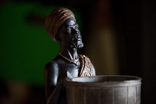
| Fill Flash normal setting (Nikon D3S, ISO 12,800, f/5.6, 1/20, 28-300mm) |
Could you take a picture with this setting, as I did in the photo above? This will light everything up. I am bouncing my flash with the diffusion dome on the flash for this photo. It is still getting light from the window, but the flash fills everything closest to the camera. The background is brighter but not as bright as the statue since it is further from the flash.
Step Four: Adjust the flash power under three stops
I choose to go three stops under because this is as low as I can go in TTL mode, and the camera is figuring it all out.
 |
| On the Nikon SB900, you push the button in the far upper left, and it cycles through under and overexposes, stopping at -3.0 EV. EV st nds for Exposure Value. |
The results are obtained by keeping the camera set at -3.0 and telling the flash to underexpose.
 |
| Fill Flash set -3.0 (Nikon D3S, ISO 12,800, f/5.6, 1/30, 28-300mm) |
You can adjust the camera and flash exposure to get even more results.
 |
| Silhouette |
 |
| Reveal |
Silhouette and Reveal
Again, I must give credit to Dave Black for coining this terminology. I have been doing this for years, but I loved how he made it sound very artistic by using a French word.
Here is how you do this photo.
Step One: Take a regular ambient reading
Very similar to the above example. Everything will look normal.
Step Two: Underexpose the photo by two or three stops
 |
| On the Nikon D3S, you depress the button to the right of the shutter, which lets you stay in an Auto setting like Aperture Mode and underexpose or overexpose an image. |
 |
| When you are depressed, it should look like this if you have never done it before. If you see something else, this may be why your photos are under or overexposed. |
 |
| With it depressed, turn the wheel on the back of the camera. Here it is at -1 stop. I would shoot one at -2 stops and even -3 stops and pick the one in which the subject is best silhouetted. |
Step Three: Set flash setting to just the opposite + stops
If you pick three stops under, you will set your flash to three stops over. You see now where the flash hits the subject, giving you perfect exposure.
[-3] + [+3] = 0 For the photo above, I had the Nikon SB900 off the camera, which was being fired by the SU800 on my camera.
 |
| Nikon SU800 triggers your SB900 off-camera using an infrared signal. Here, you can control up to 3 different settings of multiple flashes. If I had three flashes, each set to work on A, B, or C, I could control them from the camera individually. For the above example, I used an SB900 and SB800, both going off with a +3 Flash setting compared to the -3 camera setting. It doesn’t matter if I had 100 flashes. The c mera will let them fire altogether; only +3 stops. I love this technology. |
 |
| Silhouette |
 |
| Reveal |