60 Percent Of Internet Access Is Mostly Mobile
This is how the rest of the world is consuming the web, excluding the UK and the USA.
Here is a link to that story.
These are some of the numbers of visitors to my website. The main discovery is that 56% use a laptop or a desktop to look at my website.
My website worked great for anyone using a desktop/laptop to connect with the website. However, 44% were visiting using mobile or a tablet. On the mobile, the website wasn’t amicable.
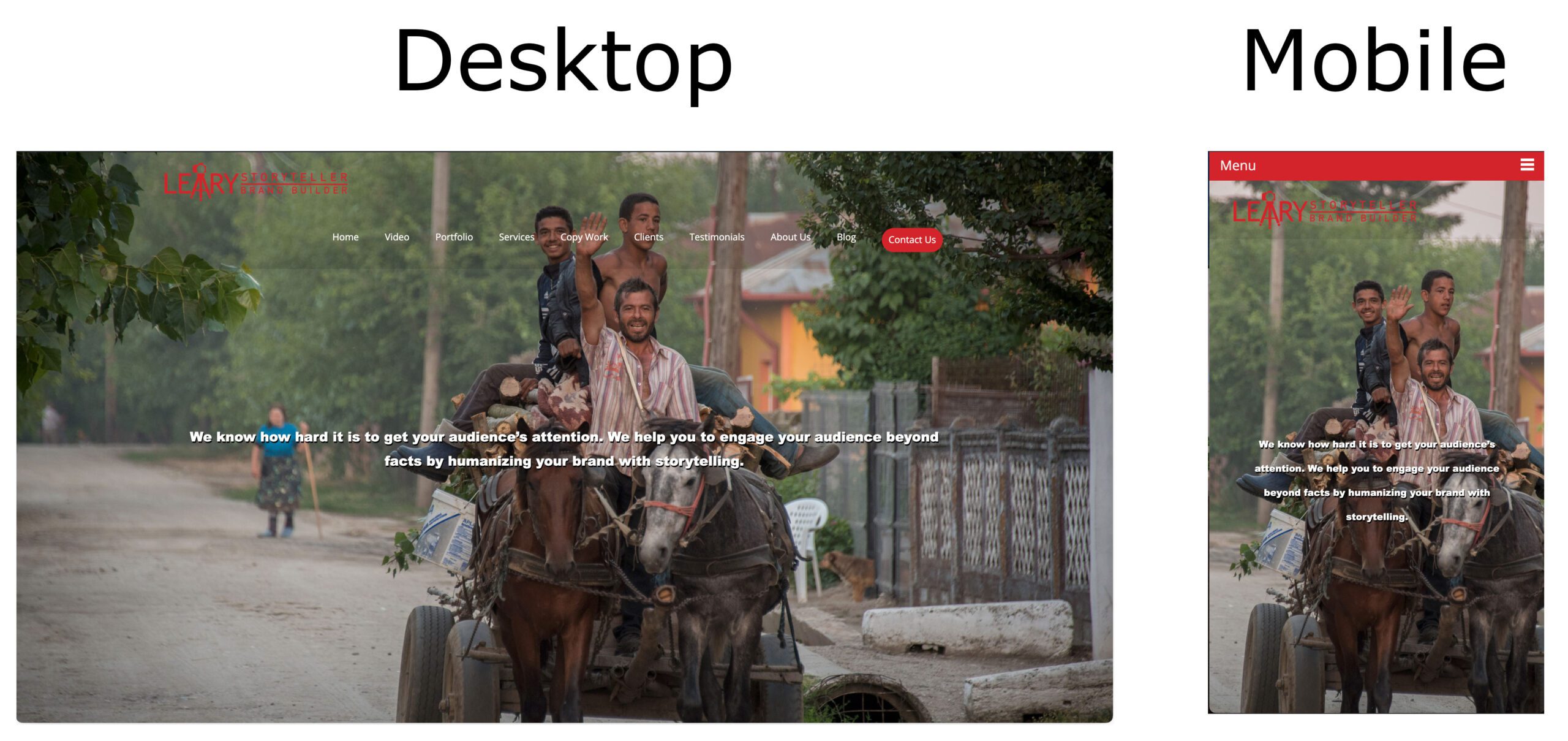
Now, viewing this blog on your mobile device, you have already seen the above photo. I realized I needed to make my main website mobile-friendly but also still a great experience if using a larger device.
Now my website looks like this on a mobile device.
Now in the corner, I have a typical pull-down menu on the web.
People often go to your website with their mobile device and then return later on a larger screen laptop or desktop. I still need to engage them because sometimes they are looking for someone like me, and I don’t want them to pass over me because my website isn’t mobile-friendly.
IMPORTANT FACT
In February 2015, Google announced that the mobile-friendly update would boost the rankings of mobile-friendly pages — legible and usable on mobile devices — in mobile search results worldwide. (Conversely, pages designed for only large screens may significantly decrease rankings in mobile search results.)
The rollout of this change was April 21st this year.
Are you mobile-friendly with your website?
I am using the website builders from Godaddy and PhotoShelter to build my websites that make them scalable from desktop to iPad to the mobile device. Of course, you can do this using a more traditional approach like Dreamweaver, but I have found these online designers are more straightforward.
Here is the link to see PhotoShelter website templates and designs. $10 a month for a mobile-friendly website.
Here is the link to see Godaddy website templates and designs. $6 a month for a mobile-friendly website.


