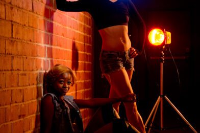
| The client was looking for a “Gritty Look,” We decided to use a brick wall to look like you are backstage and toss in the lights with gels in the background to add to the effect. |
“Our dance department needs some photos for a poster to promote the department,” was the request. After discussing the proposal and what they wanted in more detail, I realized we would wing this one.
I packed up in my van all my lights and backgrounds. Of course, I had most of my cameras and lenses with me.
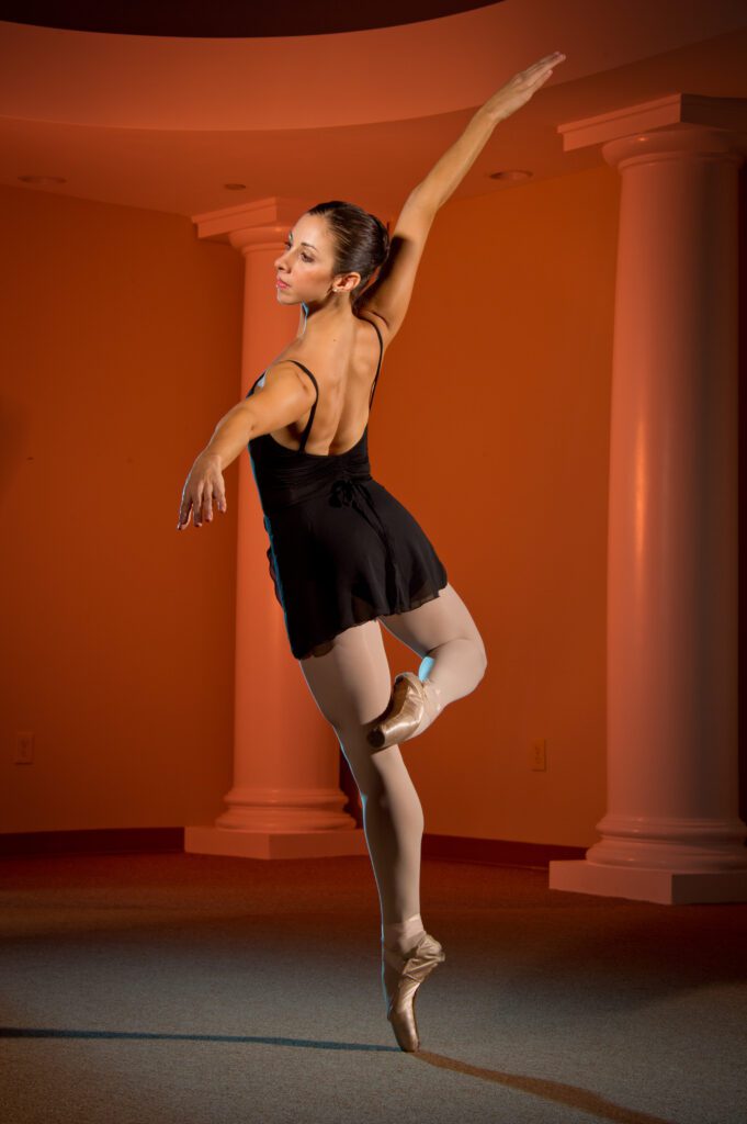
They wanted gritty and edgy in one photo. Then the college wished to other traditional images for ballet.
Here are two from the photo shoot with the diagrams of how I used lights in the photos. In my next blog, I will also show a couple more pictures from the shoot.
 |
| Here is the lighting diagram for the photo above. |
Do you have a favorite of these two? If so, why did you pick it over the other one? What would you change if you could on these photos? There is always a place to comment on these blogs below.

 |
| Here is the diagram for the Ballerina by herself. |


