How to improve your flash photography

This blog is the third article I have written on using your Flash. My first one was about avoiding the dreadful red-eye syndrome. The second article I wrote was about whether you should use Flash. Finally, I want to address the technique of off-camera Flash specifically.

First, let’s start with what we do know about Flash. We know that most cameras with flash built-in give straight-on harsh light and are subject to red eyes. The red eye is due to the Flash being near the lens. Sometimes, this is the only option you may have for a situation. In this case, getting the photo is more important than not having a picture. Almost every point-and-shoot has a flash built into them, and most people’s photos have this harsh look. The other place we see this Flash is in crime scene photography, which has been made more famous through TV shows like the CSI series.

When the Flash on the camera is pointed straight at the subject, it will look like most amateurs’’ crime scene investigation photos. In other words, anyone can get this type of photo, which is almost the norm in flash photography.

When creative directors, art directors, and editors hire professional photographers, an assumption is expected and not always stated. People hire a professional photographer to get something different than what they would do with their cameras. Picking a unique angle with a different lens may give the client something different. Still, the minute you introduce the straight-on Flash, it immediately looks like something they would or could have done themselves quickly.

Lighting has more impact on a photograph than any other aspect of photography. Without light, there are no photos, and what kind of light determines much more than whether you can see the subject. It helps shape the issue and creates a mood more than a camera angle or lens choice.

When shooting in black and white, the direction of the light helps shape the object and can make a photo have more pop or subdued, for example. In color, the color of the morning and the direction will help establish the mood. Theater type of lighting makes your subject look dramatic, for example. A lot of white light can make something look clinical or even be used to simulate the feeling of being in heaven.

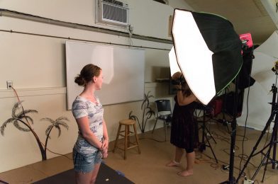
In earlier articles, I mentioned that you should avoid red eye bouncing your Flash off a ceiling or wall. What I consider one of the most dramatic types of lighting requires your Flash to be off-camera.

There are two angles which I like the best. First, having the light 45 degrees to either side of the subject relative to the camera gives a lighting effect used by the great artist Rembrandt. Rembrandt liked to have the light 45 degrees to the side of the subject relative to his perspective and about 45 degrees above his view. If the subject looks straight, you will get a small triangle on the cheek on the opposite side of the light. The shape of the nose and brow help create this triangle. You may have to ask the subject to move their head slightly to make this work right.

Second, I think side lighting the subject works well for people. Side light is where the light is 90 degrees from the camera on the left or right side of the subject.

There are two ways to achieve this technique. First, you can use a cable between your camera and the Flash. The second way is to use a remote to fire the Flash.

When using a cable (check your manual for the Flash and camera to get one for your camera), you must be physically close to the subject to get this to work. The reason is the further you are from the subject, the angle between the lens and the Flash relative to the subject will diminish, and you will have photos that look more like on-camera Flash. A straightforward solution is to buy a longer cable. However, there is usually a limit on how long this cable can be and still work with your Flash.

A slightly more expensive solution is to use a remote. There are two kinds of flash remotes: a generic radio remote and a wireless one designed to work with your Flash. Both of these will let you place your Flash away from the camera, and each has advantages and disadvantages.

The advantage of the radio remote is it works up to a distance of up to 400 feet—depending on the unit. It works around walls and even through them. The disadvantage is if you need to adjust the power of the Flash, you must go to the Flash and adjust it manually. Your TTL function—where the camera figures out the correct exposure is lost.

The advantage of the wireless system, like the SU-800 for Nikons, is you can control each flash unit separately through the units. Your camera will fire the units, and since it works in TTL mode, it will adequately adjust the exposure. While both systems will let you use numerous flashes together, the TTL wireless system allows you to ratio the lights from the unit, and therefore, you can look at your LCD and make an adjustment and never have to move. One more significant advantage of a wireless system like the Nikon is that you can use a shutter speed that is more critical than the sync speed of, say, 1/250. Faster Shutter speeds open up many possibilities—especially outside on sunny days.

Using off-camera flash requires a lot of practice to master the technique.

Will your photos be better because you use this technique? Maybe, but most importantly, they will look different; sometimes, this is enough to get your audience’s attention.

Presidential Politics Teaches Us Something About Marketing Ourselves

What is running your business like running for office? For one thing, we scrutinize the candidates for more than just their position on issues. We are evaluating more than just our product.Like politicians, we are evaluated on our looks, color, age, health, appearance, and how well-groomed we are. Our clients and prospects note all this and more about us.

What message are we sending by how we look? What part of our message as an individual can we control? Well, there’s our choice of clothing. Occasionally someone may compliment us on what we are wearing, likee the color or style.

Some people have gone so far as to wear certain types of clothing to distinguish themselves from others in their field. Take my lawyer, for instance. I think he dresses funny. But I have to give him credit, people remember him, first because his clothing makes a bold statement, but then they remember what a good lawyer he is. Your business success may profit from your visual presentation of yourself a little more attention.

How we talk and express ourselves can make a significant impression on clients and prospects. As we watched the debates, we listened to see if the candidates answered the question. We listened to how clearly they stated their ideas. We listened to their inflections and the pace of their comments to see how confident and knowledgeable they seemed on the topics.

The candidates wanted to answer the questions in ways they thought would connect with the audience at home. We, too, must be aware of our client’s perspectives. Are we addressing their concerns or our concerns?

Evaluating the candidates for the company they keep; is where your community involvement makes a difference. We should let our clients know when we go a mission trips. We must find ways totell themw that we volunteer as a coach for kids’ sports or that clients value anything outside of work.

Obama’s two young daughters help him appeal to many folks, just as Pailin’s special needs child makes her unique to others. So while our outside activities are not our direct message to a prospect — they may be necessary to some of them and shouldn’t be left out.

Greg Thompson, director of corporate communications for Chick-fil-A, says when he hires folks, he looks beyond the hands to the head and heart of the person. The arrows represent to him the transactional relationship within most businesses. It would help if you had a writer hire someone with experience who can most likely meet the immediate needs. However, looking beyond the transaction, you will see that some writers are subject experts, and some have given much of their time to a cause. Their passion for the subject makes them a much better hire than just a professional writers.

The candidates running for office have people give feedback to help them improve and refine their campaigns. We need to turn to those who can offer us feedback. We can all benefit from some sandpaper helping to refine us.

Indeed, prospects are interested in what we can do for them, but they are also influenced by who we are as people. So the candidates must present an attractive total package as we could do as well.

A dream job is more than pay alone; it’s working with someone who appreciates and makes use of my total package.

Corporate Communication Visual Tips: 11 of them

Charles G. Goldman, Executive Vice president of Schwab Institutional, leads the opening general session of the Charles Schwab conference for independent financial advisers.

There can be no words without images.
— Aristotle
More than any other technological innovation, computers are responsible for the explosion in images. Today, 20 percent of the U.S. population can use a computer. But 80 percent of school-age children have learned to become computer literate. By the turn of the century, Sculley predicts that 98 percent of all the words and pictures created in the world will be computer mediated. By that time, virtual reality — the ultimate fusion of computer and television technologies in which viewers become active users of the medium — will be inexpensive and accessible.
Educational psychologist Jerome Bruner of New York University cites studies that show persons only remember ten percent of what they hear, 30 percent of what they read, but about 80 percent of what they see and do. When all members of society whether at home, in school and on the job learn to use computers for word and picture processing, the switch will be made from passive watching to active using. There will no longer be the barrier between the two symbolic structures. Words and pictures will become one, powerful and memorable mode of communication.
— Professor Paul Martin Lester, Ph.D., Department of Communications, California State University
Visual forms of communication grab the attention of today’s audiences. Graphic representations such as diagrams, charts, tables, illustrations and photographs not only catch the eye; they draw the viewer into the information being presented.
Corporate communication departments who took advantage of this visual revolution early on are today’s leaders in the communication field. They saw this “explosion in images” coming and jumped aboard.
Endless, long blocks of type spreading across pages are rarely read. Early editors discovered a visual tool that cured this ill… they broke the copy up into short, more manageable paragraphs that didn’t intimidate or bore their audience.
Ted Turner
Today, many no longer read traditional text. Just taking brochures from the past and posting them to the web will not get the message out.
Okay, if it’s true that a skilled use of visuals will improve communication and if expertise in this area seems like a foreign language… what then?
We’d probably take classes to learn a foreign language, so to become proficiency in the use of visuals perhaps we should study art, photography or theater at the local community college. This is one way to learn how the masters in these fields used the visuals.
Mr. Bean was a British comedy television series starring Rowan Atkinson. Bean, an almost totally silent character used physical comedy to entertain. The series did well internationally because words were not important to the success of the show.
Instead of a brain storming an idea try playing a game of Charades to express what needs to be communicated about that idea. The game forces thinking in visual terms. Pictionary is a board game where teams try to guess specific words from their teammates’ drawings. More than Charades Pictionary requires forming mental pictures. Both games provide a fun way to practice visualization.
Here are Ten Tips to consider when thinking about using images:
1. Humanize – Illustrate how products affect people. For example, to show how small something is, rather than using a ruler, put it in someone’s hand. If something improves lives – show it doing just that. Today the trend is to use a more photojournalistic approach or, at least, to make it look photojournalist. To make sure the expressions are genuine set up a situation, give it enough time and it can become real.
2. Good Lighting – Sometime the natural light is perfect. Just cut the flash off and use a higher ISO for the available light. Remember that whatever has the most light on it will become the main subject.

Bill Griffeth moderates panel with Greg Valliere and Liz Ann Sonders during the Charles Schwab conference for independent financial advisers.
3. Try Black & White – Some war photographers feel that color may make even war look pretty. Black and white is a good way to focus attention on faces and graphics.
4. Get Closer – Almost any photo will be better closer up.
5. Watch the background – Look around the subject. Be sure nothing is growing out of a head or sticking in from the edge on the frame. Use a shallow depth-of-field like ƒ/2 versus using ƒ/16 to make your subject stand out from the background. If the background helps tell the story increase the depth-of-field by using f16 or f22, or vary the background anywhere in between fuzzy or sharp.
6. Consider a worm’s eye view or the bird’s eye view – Shoot really low or high above the subject. Change the height of the camera in relation to the subject; avoid making all the photos from a standing position.

Lou Dobbs
7. Turn off the date stamp – Digital cameras embed the time and date in the photo information so it is not necessary to have it print on the photo itself.
8. Variety – Make plenty of photos from different angles. In addition to using the zoom actually get closer and farther away from the subject. Make wide-angle and close-up photos. Try some without flash, some with direct flash and bounced flash.
9. Give it time – Make a few photos then stop for a few minutes. Let the subject get used to being photographed. After a while they’ll relax and the really great photos will start to happen.
10. Action and posed –Show the subject doing what they do. Let them do their job and make lots of pictures. Pose them for a good portrait, not just a headshot, but do an environmental portrait showing their work environment or signage of the place they work in the background or foreground.
11. File Size Matters – You can always downsize an image, but you can’t do much to upsize the image. Many think they can get more images on their SD or CF card by changing the file size and you can. The problem is unless you are never have plans to use the photo for more than an avatar or profile picture on Facebook then you will not be able to make prints or use it in printed pieces. Use RAW or at least the highest JPEG at the finest setting possible for your camera. You might have to find the owners manual to know how to do this for your camera.
There are many other ways than these that can improve visual communication. Like everything worth doing visual skills come from doing… from practice.
Think about it this way: Who is going to SEE your message today?