Multimedia is the way to go when going back in time

I am working on a project this year where I am interviewing graduates of the IMPACT 360 gap year program located in Pine Mountain, Georgia.

The audience for these videos is high school graduates who have not gone to college or have completed only one year of college, as well as their parents.

While there are many questions that this audience will have depending on their situation, there are a couple of questions that most will have for a person who completed the program.

I think the best question about anything you do is WHY? Why is the question that gets to the heart of most any story? Why should the audience care?

So the first question I asked Nathan McFarland was why he chose the IMPACT 360 gap year program.

The second question was how did IMPACT 360 help him in his ultimate purpose for college–getting a job.

The last question I wanted him to address was how this impacted his college plans. Did this one-year gap program add more time to his college years?

I wrote to Nathan, gave him the overall questions, and asked him if he could try and answer these questions in two or three minutes.

The first take was great, except for people walking by and talking over him. After that, the only reason I needed to do more takes was so I could get my assistant to help keep people quiet for the three-minute interview. So take a look and see what we did for this interview.

Thank goodness for the Ken Burns effect. While Ken Burns did not invent this technique, he made it famous with documentaries like the one he did during the Civil War.

Here is a screen grab from Final Cut Pro X, where I edited a still image into the video. The great thing about this technique is you can find photos of people before you talk with them. So, for example, we asked Nathan for pictures of himself at Florida State University that we put into the package, and IMPACT 360 had some photos of Nathan in the program that we also included.

The effect of moving around a still image helps create a motion that helps move the story along. You do not need to use this; sometimes, it works against you. I think sometimes we overuse this technique, but it is helpful.

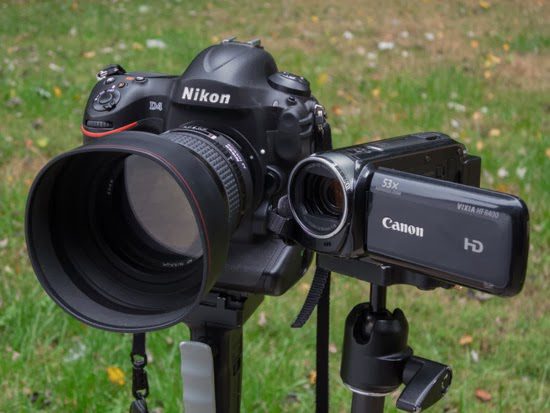
Shooting with Heart or Head is often a camera choice

Stills vs. Motion

When a photographer photographs people, they can capture decisive moments quickly. Mostly, they are reacting to what is happening in front of the camera. Those who do it the best are good at anticipating a moment, but they are still responding to how people behave in front of them. Most photographers can shoot from their hearts because when something moves them, they can capture it.

When a videographer captures something over time, they start rolling and then stop at some point. A videographer cannot just react to a moment and turn the camera on. The videographer must plan the coverage.

The primary difference between shooting stills [photographs] and motion

are shooting from their heads. They cannot shoot from their heart. Therefore, they must plan their shot more than the still photographer.

Here is an example of a storyboard from the book Using Your Camcorder by Mandy Matson.

Every book on capturing motion will address the need to plan your shots list out beforehand. Everyone recommends storyboarding your shots so you have a good idea of what you plan to get.

Regarding just capturing daily life, it is rare to get the same emotional content that a still photographer will capture because they cannot just react; they must plan their shots.

When filming, videographers not only shoot with a storyboard in mind. They must create emotion through the actors. As we know, one angle can usually improve the emotional moment more than another. The storyboard often has multiple camera angles to jump from to help make this work. They are filming Dumb and Dumber here in Atlanta. Take a look at some of the photos shot of the set by John Spink, the AJC photographer, here. You can see the same scene shot by John from two different places on the stage. He could do that because they would redo the scene over and over for different camera angles or variations from the actors themselves.

In the editing suite, they pick from multiple camera angles and different performances to craft the scene.

As you can see, to shoot a video, preplanning is required and not reacting from the heart at the moment.

The sound is the one thing that video has over stills for capturing emotion. Sound is why a good amount of the moving evening news footage is often the interview where the human voice conveys most of the feeling.

Television news knows the power of the still and uses it all the time for significant news events. For example, Eddie Adam’s photograph from the Vietnam War of the officer shooting the prisoner is always seen on the news when they talk about the war. Of course, they had a film crew who caught the entire shooting, but it is the still image that captures the emotion even more vital, or they would not be using it in the film.

I believe many of our iconic photographic images of people are where a photographer caught a microexpression. A microexpression is a brief, involuntary facial expression shown on the face of humans according to emotions experienced. They are short, lasting only 1/25 to 1/15 of a second.

Most people do not perceive microexpressions in themselves or others because they cannot freeze the moment to see it. You must slow a video down and look frame by frame to see them running at full speed; the average audience will not see them. The playback speed is why I think video has a more difficult time capturing emotions.

The Wizards Project was a research project at the University of California, San Francisco, led by Paul Ekman and Maureen O’Sullivan, that studied the ability of people to detect lies.

Truth Wizards use microexpressions, among many other cues, to determine if someone is being truthful. The Wizards Project has identified just over 50 people with this ability after testing nearly 20,000 people. So the research shows that in real time most people miss microexpressions.

For me, the photograph’s power is if they capture the “Decisive Moment,” then the truth-telling makes this a powerful storytelling medium. The picture can capture the storytelling moment that communicates emotion because the audience will have time to see and absorb the moment.

Video or Photograph?

From all my experience, I believe that the best visual storytellers use their heads and hearts.

The still photographer uses their head to plan to be in the right place at the right time. They can anticipate moments due to their knowledge of human behavior on a particular subject.

The videographer knows how to craft a sequence that will pull on your heart as a package—from a videographer’s experience, knowing what has moved their heart in the past.

My suggestion for those telling stories of life happening and not creating stories with actors is to do like so many news outlets do when it comes to communicating news events with a lot of emotion–use stills and the human voice to pull the audience in.

Three ways using visuals to show building expansion

Impact 360 Classroom

If you are engaging your audience online then one of the coolest ways to show a space is with the 360º Panoramic. Put your mouse in the photo, click on it, and drag it around, and you can feel standing in the room and turning around to see the space as if you are there.

That same interactive 360º panoramic can also be output as a still image. Still, I think most people are not quite grasping into comparison to the interactive version, but it gives you the space’s documentation space.

The traditional still photograph

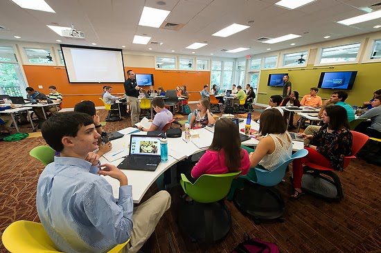
This single wide-angle image of the classroom gives the viewer the feel of the room.

It gives you a slice of the room in a moment in time. In addition, however, you can use a series of photos from the classroom to help provide a complete story of the usage.

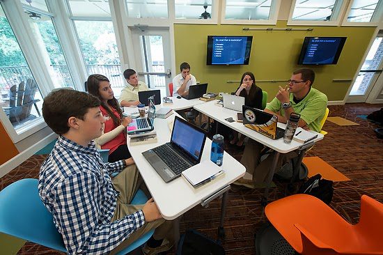
Small groups in the classroom use technology at the desk with also larger monitors to share what one person has on their device with the group.
Here you can see the groups in discussions with the instructor moving through the space to check in on each group. The area is large enough that group discussions are possible without interfering with each other.
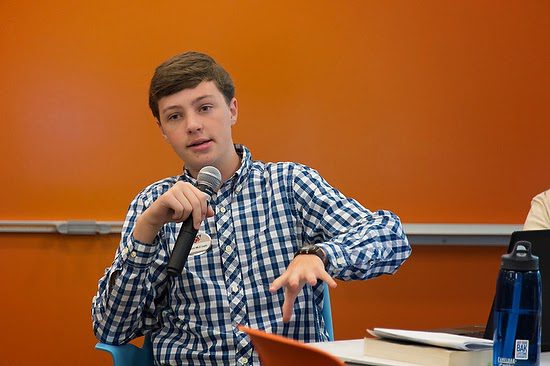
You can see here that the student is sharing with the classroom and using a microphone to ensure everyone can hear what is going on. They also can use video in the school to create live classrooms online for those around the world to participate.

Video

[youtube https://www.youtube.com/watch?v=kdB2E1mz-mo]
Just a quick clip can help communicate the space to your audience.

[youtube https://www.youtube.com/watch?v=bgTKczVc0as]
Video is at its best when you want to lead your audience through the message. Here in this clip, I can tell a complete story about the expansion of the IMPACT 360 gap year program in Pine Mountain, GA.

Which one is best?

Too often, people think more about “either/or” rather than “and.” The answer to this question lies within the strategy of your plan. If you do not have a design, you are more prone to make a significant mistake.

For example, had I only done a video, the organization would have nothing to use in the printed newsletter they send to all their supporters.

Had I just done the panoramic interactive, I would have something online and, as you can see, the stretched still image for a printed piece.

What about doing it all every once in a while for those big projects where you will use the stills, the interactive panoramic, and the video to help engage your audiences in many different spaces?

I contend that today, the still image is often overlooked for video. The video appears to be more sexy and cool. However, I believe that the base from which all visual communications of a project similar to this must contain the still image. Even NPR realizes the power of the still image and its importance in their online packages.

They took away the video cameras to train their people to make strong still images. Why do this? Just go to their website at http://www.npr.org/ and notice how they use the still image as the place to start. Before you click on any video online, it usually has a placeholder of a still image. If that still image isn’t engaging, then you have most likely wasted all that money on a video that few will see except those who already would watch it regardless.

Remind yourself not to be trapped into thinking “either/or,” but instead think “and” when choosing a medium for your audience.

Atlanta Skyline from Georgia Tech