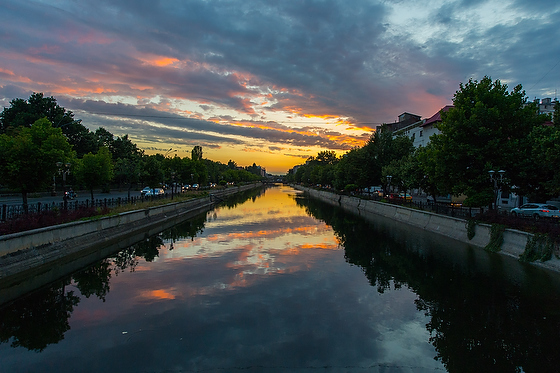
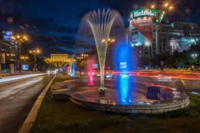
| Nikon D750, AF-S NIKKOR 28-300mm f/3.5-5.6G ED VR, ISO 100, ƒ/22, 25 sec |
We are progressing through the multimedia workshop here in Bucharest, Romania. Last night we went out on the town to get some b-roll for the student’s projects.
 |
| Nikon D4, AF-S NIKKOR 14-24mm f/2.8G ED, ISO 2200, ƒ/4.5, 1/500 |
Bucharest has canals and water fountains that it is known for. I also wanted to capture the reflections at night time in the water and the blurred car lights.
 |
| Nikon D4, AF-S NIKKOR 14-24mm f/2.8G ED, ISO 12800, ƒ/6.3, 1/200 |
Don’t light everything evenly if you want to make your photos better. Shooting at night is one of the very best ways to shoot and make your photos more dramatic since only where you have street lights, car lights, or anything since the sun isn’t lighting the scene helps you grab people’s attention.
 |
| Nikon D4, AF-S NIKKOR 14-24mm f/2.8G ED, ISO 200, ƒ/9, 1/500 |
Notice here in the daytime scene how the light is more even on everything, which means your eye has no direction as in the top three photos.
 |
| Nikon D4, AF-S NIKKOR 14-24mm f/2.8G ED, ISO 1800, ƒ/5.6, 1/500 |
To make this photo work as a group selfie, you get physically close to direct the audience where to look.
 |
| Nikon D4, AF-S NIKKOR 14-24mm f/2.8G ED, ISO 2200, ƒ/5.6, 1/500 |
I am only inches away from the subjects here with my AF-S NIKKOR 14-24mm f/2.8G ED lens. Being close helps me be sure you know to look at the photographers. Now, if it were pitch black, I could be a bit further back and have light only on the subjects, and then you would go right to them. However, with the light, even though the scene, you must rely heavily on composition and not the light to make the photo work.
 |
| Nikon D750, Nikon 85mm ƒ/1.8G, ISO 100, ƒ/1.8, 1/500 |
In the last photo, we are inside, where the evenly fluorescent lighted classroom makes it difficult to use light to direct your eyes. So here, I used a Nikon 85mm ƒ/1.8 lens to isolate the subject through framing and the shallow depth-of-field to help you force the audience toward the student and teacher as they work on a project.
I think it is pretty apparent that the first three photos are more dramatic and grab the audience’s attention than the other photos and all of this is due to not lighting the entire scene evenly.


