Impact 360 Classroom
If you are engaging your audience online then one of the coolest ways to show a space is with the 360º Panoramic. Put your mouse in the photo, click on it, and drag it around, and you can feel standing in the room and turning around to see the space as if you are there.
That same interactive 360º panoramic can also be output as a still image. Still, I think most people are not quite grasping into comparison to the interactive version, but it gives you the space’s documentation space.
The traditional still photograph
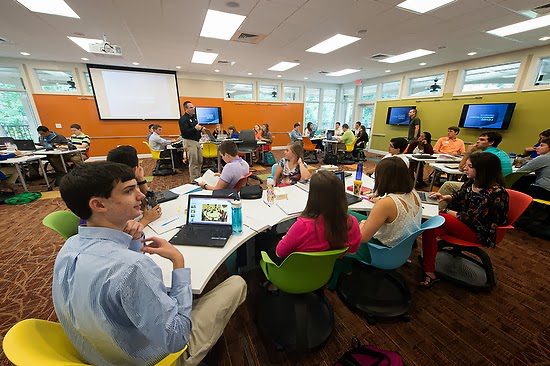
This single wide-angle image of the classroom gives the viewer the feel of the room.
It gives you a slice of the room in a moment in time. In addition, however, you can use a series of photos from the classroom to help provide a complete story of the usage.
 |
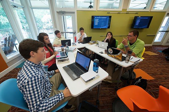
| Small groups in the classroom use technology at the desk with also larger monitors to share what one person has on their device with the group. |
 |
| Here you can see the groups in discussions with the instructor moving through the space to check in on each group. The area is large enough that group discussions are possible without interfering with each other. |
 |
| You can see here that the student is sharing with the classroom and using a microphone to ensure everyone can hear what is going on. They also can use video in the school to create live classrooms online for those around the world to participate. |
Video
[youtube https://www.youtube.com/watch?v=kdB2E1mz-mo]
Just a quick clip can help communicate the space to your audience.
[youtube https://www.youtube.com/watch?v=bgTKczVc0as]
Video is at its best when you want to lead your audience through the message. Here in this clip, I can tell a complete story about the expansion of the IMPACT 360 gap year program in Pine Mountain, GA.
Which one is best?
Too often, people think more about “either/or” rather than “and.” The answer to this question lies within the strategy of your plan. If you do not have a design, you are more prone to make a significant mistake.
For example, had I only done a video, the organization would have nothing to use in the printed newsletter they send to all their supporters.
Had I just done the panoramic interactive, I would have something online and, as you can see, the stretched still image for a printed piece.
What about doing it all every once in a while for those big projects where you will use the stills, the interactive panoramic, and the video to help engage your audiences in many different spaces?
I contend that today, the still image is often overlooked for video. The video appears to be more sexy and cool. However, I believe that the base from which all visual communications of a project similar to this must contain the still image. Even NPR realizes the power of the still image and its importance in their online packages.
They took away the video cameras to train their people to make strong still images. Why do this? Just go to their website at http://www.npr.org/ and notice how they use the still image as the place to start. Before you click on any video online, it usually has a placeholder of a still image. If that still image isn’t engaging, then you have most likely wasted all that money on a video that few will see except those who already would watch it regardless.
Remind yourself not to be trapped into thinking “either/or,” but instead think “and” when choosing a medium for your audience.
Atlanta Skyline from Georgia Tech

