| |
| Hotel Avenida Palace, downtown Lisbon, Portugal [Fuji X-E2, 18-55mm, ISO 6400, ƒ/2.8, 1/90] |
I am returning after a week-long Visual Storytelling Workshop in Lisbon, Portugal. While doing the workshop, I started watching how the students were already engaging their audience, and then it hit me—The Still Image is King in Social Networking.
You can see how Esther Havens successfully shares a photo and gets more than 86 “LIKES” on Facebook. Note one thing different than most people who share photos—CAPTION!
A short caption with a strong image engages enough people to click on “LIKE,” This doesn’t include all the people who saw the picture and may enjoy it even more, but just don’t click “LIKE.”
My friend John Spink, the Atlanta Journal and Constitution photographer, shares a personal photo and adds a small caption. Look at the number of LIKES—73 total.
Again the key to pushing those likes up is a robust photo and good caption that entertains those that follow him.
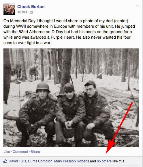
Another friend Chuck Burton, Associated Press Photographer, shares a photo of his dad. Again please notice the image is interesting, and the caption adds more information making the picture more impact. 68—LIKES.
After talking to the students about how they already have an audience, but just to post strong images with a short caption that tells a small story Amanda Ross, one of the students, started doing this and experienced for the first time her posts taking off with “LIKES.”
This screenshot is that post that she shared. WOW, 8,2—LIKES.
Social Networking Tip
People enjoy Social Networking because they enjoy the small snippets to catch up and keep connected. The key to being what Seth Godin calls a sneezer is entertaining. It would help if you kept it brief in the social networking circle. If you want to post longer posts, then you need a blog.
If you want to understand the idea of a sneezer, read Seth Godin’s book Unleashing the Ideavirus.
To show how to make your idea infectious, Seth, in his book, examines what makes a powerful ‘sneezer,’ how ‘hives’ work, and applies the concepts of critical velocity, vector, medium, smoothness, persistence, and amplifiers. As Godin shows, the now-familiar idea of viral marketing is one particular form of Ideavirus marketing. Most businesses will not be able to engage in proper viral marketing, but all can use the Ideavirus approach.
I recommend diving into understanding how social networking operates for successful people. For example, we are no longer living in a world where a marketer can effectively just push their agenda. Instead, it would help if you were interested in creating a following.
Read The Power of Pull, which explains how you must create something of interest for people to pay attention to. Just telling people, they need this is not as effective as creating content that draws them to you.
There is another book I would recommend to those trying to get their work viewed and make them relevant for clients to hire regularly.
Seth Godin wrote another top-seller Tribes:We Need You To Lead Us.
“Real leaders don’t care [about receiving credit]. If it’s about your mission, about spreading the faith, about seeing something happen, not only do you not care about credit, you actually want other people to take credit. There’s no record of Martin Luther King, Jr. or Gandhi whining about credit. Credit isn’t the point. Change is.”
― Seth Godin, Tribes: We Need You to Lead Us
Most of the photographers I am meeting are wanting to change the world through their photographs. Many of them call their work humanitarian photography.
If you are wanting your images to change the world let the work speak for itself. Share those images and give people something they can digest in a quick glance on Facebook, Twitter, Pinterest, Instagram or whatever social network you choose. The key is the photo, if strong, will stop them and then read your caption.
When people move from “LIKE” to “SHARE” you are now creating change.
What follows after you do this for a while? People will follow you on Twitter and request to friend you on Facebook. If you goal is to get people to follow you then this is where creating a separate page just for your photography can be a good thing. This way you are able to post those images with captions and create a following separate from your close friends.
You can also just share with your friends or the world. Just choose when you post if you want the Public, everyone, or just your friends to see the post.
Why the Still Image is King?
Twitter is an online social networking and microblogging service that enables users to send and read short 140-character text messages, called “tweets”. The reason for the success of Twitter is the short message. Instagram even in the name communicates that keeping it quick and short will be more successful than a larger post.
Instant Messaging also is successful due to the brevity of the message.
YouTube has grown as well as it’s own social networking platform. My recommendation is to build a following on a project with still images and captions over a period of time that builds up to the release of the video.
Your audience will be more interested in taking the TIME to watch your video if they have an idea about what it is about. Keeping your teaser short is why trailers for movies exist. Think of the still image as quick trailers that will create the audience for the release of your video.
Your audience will more likely stay tuned into the video if they are willing to commit to the time to watch it. If you are successful as a person worth following they will commit to watching it.


