Visuals verses text: The Eureka Effect

The Aha! effect refers to the common human experience of suddenly understanding a previously incomprehensible problem or concept. — Wikipedia

Text is the core communications medium for most organizations. Due to this over reliance on text these organizations share a common mistake of writing a visual story without watching the visuals in front of them as they write.  Too often, a video or slide show story is not connected to the text. A good story is hooked to the visuals and audio.

A rule of cinema is to “show, don’t tell.” Maybe this can be revised to “Show what you can, and tell what you can’t.”

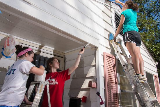
Roswell Presbyterian Church’s Middle School Youth with SonServants  and Widows Harvest to help do projects like: building wheelchair ramps and landings, scraping and painting houses, putting new roofs on homes, or landscaping and yard work.

Now there are a few things that are very difficult to write that a photo can help communicate. Emotional connections are moments where a gesture can connect people that trying to describe this would take a few pages of text.

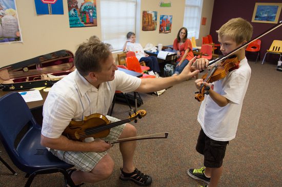
The Suzuki teacher connects with the child in a tender instructional moment that text would struggle to communicate as effectively. Also, in this photo you can see the proud mother of the student in the background pleased with the instruction her son is getting. 

A few photos of a story can help set the tone and help the writer get deeper into the content. Your audience will appreciate a story with more meat to it than one that glosses over the content.

A child is working on an art project during a Suzuki workshop. They provided this creativity time for those moments when the young students were not playing and needed to stay on campus while waiting their turn. 

I thought capturing a student working on a fun craft project showed that creativity is in these students and looking for ways to come out. While music is one way the workshop was helping these students, they also provided a moment away from the music to be creative as well.

Show what you can

Detain shot of the lab project for DNA testing procedure.

Now I wanted you to first see the closeup photo here of the materials the students will be extracting the DNA from in a biology class. Notice how the photo begs the question of what is this?

Here the student is getting a measured amount of the substance that will be tested.

Notice in the second photo here of the lady in the lab there is less of a question and more of a statement that happens.  Maybe the closeup photo is a better hook and once you are into the story you use the photo showing the taking a sample by the student.

Now imagine the story on teaching DNA extraction tests without any of these photos. Which one would you even begin to read?

Physics Lab 

The professor asked the students to gather around her as she walked them through the lab experiment they were doing that day. 

What is very interesting here is how this professor walked the students through each step. She even would pause to talk about how if you don’t do one thing then your results will be affected.

The professor adds a little humor in the demonstrations. Now I am shooting fairly tight, but just loose enough to show the students trying to see what she is doing and their emotional connection in the moment.

Now just hang around any class where students are doing something for the first time and you will see this next moment. They come to the teacher and ask a question. The teacher then realizes there is some missing information the student is not giving them.

Even after the professor had showed them this step, there is still more show and tell needed to be sure the concept is understood.

Now if you are a writer experienced a similar teaching moment like this physics class, then you understand how images will help clarify a moment.

If you look closely in the last photo the girl in the purple is having a small “eureka moment.”

Don’t fall into the trap of just taking photos and using them. Be sure your visuals are communicating. The best thing you can do is to show a photo to someone who doesn’t know anything about the story or the people and things in the photo. Ask them to tell you what they see when they look at the photo. Not the obvious things, but like in photo of the teacher laughing they may say I see a good teacher.

You might ask why and they would say she looks fun and the students are reacting to her positively.

 Remember to “Show what you can, and tell what you can’t.”

Key to work is the right questions for the professional communicator

When is the last time you asked these core questions about a project?

  1. What is the story?
  2. What is the purpose of the communication?
  3. Who is the audience?
  4. Why does the story matter?
  5. When will the audience pay attention?
  6. Where will the audience find the story/message?
Today’s editorial photographer needs to be more concerned with these questions than ever before. 
What has changed to make this so important? It is easier to ask what hasn’t changed and the answer to that is storytelling. 
Today when a professional gets a call to help tell a story, there is a very good chance they will be involved all the way through the process.  If you are not involved there is a very good chance you will be replaced by someone who can be involved more than just making photos.
There are a lot of stories that are quite entertaining that will not help the client achieve their goals. Too many storytellers are more wrapped up in the story rather than the purpose of what the story is to help achieve.
Audience Retention
Today if the audience is finding the story online we now can study how long they were on the page and with video at what point did they stop watching. This is valuable information to the client and the professional communicator.
You can evaluate the effectiveness of your package with the audience.
Nonprofits can track the viewers giving to the organization. Bill Bangham the editor of Commission Stories, a tabloid sized publication for a missionary organization found out the organization had paid for research to see how effective the publication was. At first Bill was upset because they didn’t tell him this was going to take place. However, he was pleasantly surprised to hear that his readers gave more than 43 million dollars to the organization making up more than 50% of their budget. The cost to produce the tabloid was only $200,000 a year.
After seeing the numbers those who thought they could save the printing costs and putting it on line, it was clear that was the wrong thing to do with this audience. The audiences liked connecting to the organization through the tabloid size publication and were continuing to support the organization due to the story content.
Who’s the audience
For a video I posted to help understand how to use a Depth-of-field preview button the audience was 95.6% men.  What was surprising to me is I was thinking a lot of undergraduate students would watch this, but the numbers show that primarily men ages 25 – 64 were the audience and the largest segment to be those 45 – 54 years of age.
If I were trying to reach the younger crowd I missed the mark. After doing a number of videos and blog posts I am starting to see certain topics draws in audiences more than other topics.
If I continued to only produce content that is popular then I would be missing my purpose. My purpose is to help people grow in their photography. Some of the topics I write on are key to success and the least read. 
I must revisit these topics and figure a better metaphor, example or another way to hook the audience, because some of the content is the most important for those seeking to be professional photographers.
Key to more jobs
Understanding that you are responsible for more than just a small piece in the communication puzzel will help you be more valuable to the client. Asking questions that help you understand how your content will be used will help you to provide better content.
Today I am just as likely to shoot, produce and post the content of a story. When I started I just made a picture and then many other hands touched it before the audience ever did. 
The best part of being this involved is the content I produce is so much better. The reason it is better is because I am asking more of the core questions to understanding why we are producing a story for an audience.

Photographers need good content just like comedians

Jeff Justice at The Punchline in Atlanta, GA.

So you get the big opportunity to show your work to National Geographic. You WOW them with your work and things couldn’t go any better at this point. Then they proceed to the next step in the process–your ideas.

You see there are literally thousands of photographers who if given an idea can execute it well. What will determine if you get a job from them will have as much to do with your ideas for stories.

Story ideas?

Freelance writers and photojournalists are always writing query letters to editors. A query letter gives editors and agents what they want.  Query must be short and grab the attention of the person being written to about the idea.

Your goal is to convince them that your idea is good for their audience and that you are the person to do the job for them.

After my wife took a comedy class from Jeff Justice, I realized comedians are having to generate good ideas for their routines in much the same way photojournalists are looking for good ideas.

Listen to Jeff Justice talk about how a comedian finds a good premise for their routine and then what it takes to perfect this skill.

[youtube https://www.youtube.com/watch?v=XCRin0AmID4]
Persistence

After I interviewed Jeff we were talking and he mentioned he saw a video that followed three comedians through a year.

In the beginning one was funny, one was OK and one sucked. The one that sucked they even interviewed his parents and they didn’t understand why he was trying to become a comedian.

About half way through the year the guy who sucked stopped pointing to others that were funny and started to see the humor in himself. This was a turning point.

At the end of the year the one who was funny was about the same and so too was the OK guy, but the change was in the guy who sucked.  He was great.

Jeff said the reason he was great is he worked harder than the other two and through his persistence was able to put it together.

If you are not quite there, maybe you need to ask yourself–how much time am I willing to dedicate to photography? If you are not willing to commit to 4 to 5 hours a day, maybe you need to find another path for success.

Jeff Justice’s Comedy Class

Here is a little promo for Jeff’s class in case you are interested:

[youtube https://www.youtube.com/watch?v=RHHcMo9mjnQ]

Two photographers add services for their clients

Two Photographers

Two of my close photographer friends have been going through growing pains after more than 30 years in the industry. Gary S. Chapman and Robin Nelson started in Newspapers as photojournalists and both of them have been freelancing for most of their careers. 

I have watched both of them continue to find clients and continue their passions of storytelling. Each of them have explored using video to tell stories and both have done some work with video. 

While many in our industry have been preaching that to get jobs you must embrace video the two of these photographers still believe in the power of the still image. 

Today both of them would most likely describe themselves as visual storytellers more than they might have when they were working on newspapers. 


Writing

Gary S. Chapman is a humanitarian photographer who travels the globe doing coverage for his clients. Often his wife Vivian, who is a writer and producer has collaborated with him on many projects.

Gary has made just about every change possible to stay current with the technology to provide the very best product for his clients.

Storytelling is core to his work. He has captured real moments as opposed to setup situations in order to respect the dignity of the subject and remain true to representation of the story.

Gary started blogging early to share these stories of the people he was meeting around the world. He was being sent to places where people needed help. For example Gary was meeting people whose entire families were killed in front of them by another group. While the organizations were getting the photos they did not always use them to their full potential.

Due to budgets being cut everywhere Gary was traveling alone more often and didn’t have Vivian to write the story for him. Out of necessity Gary began to write short stories for his blog about the people he was meeting.

Check out some of these stories by Gary on his blog here http://garyschapman.com/blog/.

In the past year Gary started to ask the NGOs if they would like him to write short stories and help them blog about the stories they were sending Gary to cover. The only additional costs to the NGO was a little more to cover Gary’s time for writing.

It won’t be long before Gary is going to need to change his title from “Humanitarian Photographer” to “Humanitarian Photographer/Writer.”


Video and Stills

Robin Nelson is as passionate about telling his subjects stories as Gary.

Whenever I call Robin and we get together for some coffee I am always asking what he is working on. The overwhelming time is spent on telling me the struggles these subjects are going through and how wonderful these people are as human beings.

A little over a year ago Robin took the plunge into video and went to the Immersion Conference. While the teachers were trying to keep the students from using stills in their projects and only video, Robin resisted. He wanted to incorporate what he was already doing with the stills and not abandon them as many others had done.

While many photographers talk about their work as being the voice for the voiceless, this could not be more true than with Robin’s passion for the developmentally disabled. The difference with Robin is he is involved helping this community even when he is not photographing them. His own son has some challenges and Robin has seen first hand how society expects everyone to pull themselves up by their own boot straps even if they don’t have boots.

[youtube https://www.youtube.com/watch?v=M5iHiYB4H7U]
This is one of the video/still packages Robin has done for the Georgia Council on Developmental Disability’s ‘Real Communities’ initiative.

How Robin was able to get this project is he was already known by the advocates in this community. They saw him at their meetings and saw the stories he was publishing through traditional media for years. It was because of this ongoing relationship he was able to have them approach him about the stories they wanted told.

Now Robin occasionally writes stories, but this new way of combining his photos with the actual voices of the subjects has him excited.

Here is a link to Robin’s website http://www.assignmentatlanta.com/.


Executive Producers

Robin and Gary might not see themselves as executive producers, but they are living the role. They are no longer taking photos and handing them to organizations expecting the organization to know how to use them to tell the story.

Both Gary and Robin are producing packages that are being used more today by their clients than the photos alone were being used in the past. They have solved problems for their clients.

In the past the clients had to take the photos of these photographers and then create a package for their audience. With budget cut backs and frankly a lack of knowledge of how to do what Robin and Gary offer, clients are eager to work with someone who gives them a product ready to go.

Both Gary and Robin were noticing for years that their photos were not getting used enough by their clients. Both of them ended up putting together their own packages for their blogs. Their passion helped them to pursue new skills that their clients now embrace.

Are you passionate enough about your subjects to tell their stories even if your clients fail to tell the story? You need fire in your belly to work as hard as Robin and Gary to take on more work like they are doing. I am sure that the subjects of their stories today are glad they did.

So you wrote a great lead, but who’s reading?

This is how many writers are publishing their articles online–no photos. The photo on the right here is an advertisement and not part of the story.

Writing a good lead for a story frees you up to write the rest of the article. The lead announces and grabs the attention of the reader. It will help define the style of the writing to come.

If you are like many writers posting to the web you are examining the results of your articles. You are watching those page hits.

The Computer is a Clue

Here is a big clue as to why a lot of people are not reading your work. It is on the computer.

Macintosh was the first commercially successful personal computer to feature a mouse and a graphical user interface rather than a command-line interface. It was successful because most people prefer working with and looking at images rather than text.

A look at Church history with text

Let’s go back even further to help make the point that people are not just naturally drawn to text. The first 300 years of the Catholic Church there was no Bible. In 1041 moveable clay type was invented in China.

It wasn’t until 1440 when Johannes Gutenburg had his first workable printing press.

How did Christianity spread around the world those first 300 or even 1440 years with almost no text readily available to the masses? Not only was text limited, the masses were illiterate. There were no churches until 231 AD.

Early Christianity was primarily an urban faith, establishing itself in the city centers of the Roman Empire. Most of the people lived close together in crowded tenements. There were few secrets in such a setting. The faith spread as neighbors saw the believers’ lives close-up on a daily basis.

It was during these times of no Bibles, when Christianity spread around the world.

Even Text Heavy Newspapers Changed

Today even the Wall Street Journal leads with photos on their website.

Pick your lead photo just like you pick your lead text

A good Associated Press Photo captures the story like a good lead does with text. It is telling the story with a picture that records a moment in time. It is the fleeting moment that in an instant sums up the story. The famous Magnum photographer Henri Cartier-Bresson called this the “Decisive Moment.”

A good lead is more like a good question than a statement. The statement does not necessarily make you want to read the rest of the story. The lead may be a statement, but the statement of a good lead makes the reader ask a question. They want to know more.

Here is a page on Patch.com of my community Roswell, GA. of the six photos, which are acting like leads to a story one is an advertisement. Of the five remaining I defy you to have a clue as to what the story is about based on the images alone.

I am consistently seeing writers who are in charge of their websites totally clueless to how to use visuals. Like in the example above from Patch.com images are used only because they know they need images, but they have almost nothing to help you like a lead would to get you to want to read the story.

This is a closeup of one of those stories. The photo shows the back of a room that looks like a church with pews. I guess it could also be a court room, but this is what was picked as the lead to the story on the budget.

If I were to write what one sees when they are looking at a photo, would it be a successful lead? It should be if it is going to work.

Which photo would you use?

I shot these photos for a story on Mexican coffee farmers that formed a cooperative that is helping save their farms and community.  Which would you use as a lead?

In my opinion any one of them could work.  They all introduce the topic of coffee in some way, but they all make you want to ask a question about something in the photo.

Now here are some other photos I took on the trip that are nice photos that I often will see writers use to start a story.  See if you agree.

They are all nice photos. Some are quite strong even.

Can you see why these do not even help you introduce coffee into the story? I even use these in my story, but they are not the lead photo. They do work in many ways to ask questions. You might want to know who the people are and why they are happy or what are they talking about.

You can take a look and see how I used them in the multimedia piece here:

[youtube https://www.youtube.com/watch?v=Q9wmMSv3SoY]

Art for art’s sake or storytelling?

So, are your photos good leads for the stories? Maybe this is a clue as to why the readership numbers on many of your stories is so low.

Remember, the biggest change for the computer was when Macintosh introduced a graphical interface that replaced using text as the main way to navigate on a computer.

Today people enjoy touching their screens of their iPads and iPhones to move around.  They are clicking on what visually interests them.

When it comes to storytelling all the research shows that strong storytelling images will engage a reader far more effectively than text.

Now that you know how important a good visual lead is to a story, how much time and effort are you going to dedicate to creating them. Doesn’t it demand even more attention that a good text lead? Your audience thinks so if you don’t.

Where does your eye go first?

Turn your photos upside down; this will help you see where your eye goes first.  After seeing where your eye goes first, is this where your audience wants to look? Nikon D2Xs, ISO 400, f/7.1, Nikkor 24-120mm
Fair values are one of the most significant factors influencing where someone looks.  Nikon D2Xs, ISO 400, f/7.1, Nikkor 24-120mm

Start upside down
One of the ways I was first taught to look at a photo is to turn it upside down.  This way, you see how the photo’s composition and light values will direct someone to what is essential or away.

The light values alone have a tremendous effect on the viewer.  If you put a black dot on a white paper with nothing else or a white dot on a black piece of paper, your eye is drawn to the dot.

With more stuff on the paper, the principle is still the same. The contrast of the light value to the rest of the scene will draw you to a spot.

Now that you know this, you should be able to help create a photo that directs the viewer based on fair values to the subject.

The ceiling helps to add some graphic qualities to the photo.  Nikon D3, ISO 400, f/7.1, Nikkor 24-120mm

Graphics

Sign manufacturers have used big arrows to direct you to a store location.  You could use a large hand to show people where to look, or you can use this same principle more subtly to direct the viewer.

Leading lines and perspective can help pull you into a photo and give the image some depth.

While straight lines hit you over the head, directing your eye, the S-curve is a classic way to draw a viewer’s eye.  One of the most common uses in the scenic photo is the river winding through a scene.

Framing


Here I am using the tree and the people in the shadows as framing at The Citadel. Nikon D3S, ISO 200, 1/1250, Nikkor 24-120mm

While a photo might look good in different frames, you can buy it at a frame shop. You can also use elements in an image to help frame the shot.  This framing often helps create a sense of depth to a photo and not just a border like a physical frame.  Looking through a doorway to the subject in a room helps create some context.

Using the flowers to fill in what could be an empty space.  Nikon D3, ISO 1600, f/5.6, 1/5000 Nikkor 14-24mm

Flowers in the foreground and the subject like a house in the background help fill what would often be dead space in the photo.

Hey there’s more

While your eye may go to the young man setting the table and it is telling a story, your look will likely drift to the woman at the stove cooking and then to the people in the back room.  If I did it right, your eye would drift around looking at the more minor details because I got your eye moving, and once it is, it will explore.  Nikon D3S ISO 12,800, f/5.6, 1/40, Nikkor 14-24mm

You can make a nice composed photo of a subject and do a great job creating a good image of the issue.  You can also make a more storytelling photo and not just a pretty picture.  These are photos that you may be drawn immediately to the main subject, but your eye continues to be moved around the scene, and you are learning more about the story.

Some photographers have you looking only at the subject and not much more.  The seasoned storyteller will have you looking all around and absorbed into the content.

Multi-layered compositions take time and help tell the story in its context more. It also is more entertaining but requires time for the audience to absorb. Photos like this need a longer pause in the slide show or video. Sometimes in magazine story spread, you let them run over two pages to let the audience see all the action.  Nikon D3S ISO 5600, f/5.6, 1/250 Nikkor 14-24mm

Example of shooting an event to tell the story

1
This is our family at Nelson’s graduation from the US Army Armor School at Fort Benning, GA. 

The event: Our Son Graduation from The US Army Armor School at Fort Benning

I wanted to lead with the most common photo many of us take at a graduation. The family has a group photo with the graduate. I setup the photo before I got into it, so there are some things I did for this first photo that I recommend.

  1. Turn the flash on. In this photo you will quickly notice that had we not had the flash on you would have not seen our graduate’s face due to the shadow of the hat covering his face.  If you look closely you will also see how on my daughter the shadows would have been worse around her eyes without the flash.
  2. I used the background to help our family remember a little about the event. Nelson is part of the Cavalry and the statue behind him helps capture that as well as his hat.  In addition the building is the main building for the Armor Division and is called Maneuver Center for Excellence.
  3. Spacing of the group is done so you can see everyone’s face but we are not too far apart so that when you take the photo the faces are too small.  
  4. The front to back is well used. We have the family closest to the camera and not right next to the statue or the building.  This is a common mistake many make, because to then show the statue for example and the family you would back up and everone’s face would be like the size of a dot in the photo.  
  5. Some angling to not be perfectly parallel to the building.  This helps create depth to the photo.
2
Statue to help communicate this building is the home of the Cavalry.

Detail shots help round out the coverage for the day.  I took a moment and walked around the statue until I found an angle that helped to communicate the power of the statue.  Shooting up really close made it where I was shooting almost straight up.  This helped make the statue look powerful.  Further away would have taken away the emotion of the power.

Look for details and then notice I had a purpose for the photo.  I wanted communicate something.  If you don’t know neither will your audience.  Take a moment and think why you want the photo.

3
Capturing emotions helps to communicate

I know that if you go through some of the intense training the military, then you most likely have developed some emotional connections to others on the team.  This was not an event for me, this was our son’s graduation.  I needed to show what this school meant to him.  One of the ways to do this is to show people reacting to their friends. 

4
While this was not my son, capturing others enjoying each other help to communicate the bonds formed in the school.
5
When a subject looks into the camera they are looking at the audience.  While I prefer unposed photos of subjects reacting to people and not the camera, sometimes their a moments where the subject engages the viewer.

I notice people using their cameras probably more than most since I do this for a living. What I think this captures is how important an event is to a community.  When I take a photo of others taking photos it shows that to these “photographers” this is important to them. 

6
His role is to help update the social media pages for the unit and here he is getting some visuals for his next post.
7
At attention for the national anthem.

Patrick Lencioni, author of the New York Times best seller “The Five Dysfunctions of a Team” says ceremonies are important for people to move on in life.  He even said that weddings are as much a funeral for those leaving single life as it is about the joining together. 

After hearing Lencioni speak on this topic I realized how important the symbolic ceremony is to helping us with changes in our lives.  The simple act of listening to the national anthem changes everything when you are at a military ceremony. It brings to your mind and heart the commitment of soldiers for our country.

8
Capturing not just a prayer, but for me I see the elected official and the military in this photo.

In the middle of the two officers on stage was the Governor of the State of Georgia. Our elected officials are responsible for calling for war on a country.  It highlights the importance of going to our polls to elect not just someone because they may believe in similar ideals that we want fostered. It means electing someone to office you trust will have the mind and heart to carefully consider what the right thing to do is when we ask these soldiers to lay their lives on the line.

9
I shot this as tight as I could and tried to use the American flag to help communicate this is an elected official.  This is Governor Nathan Deal of Georgia giving the keynote address to the graduating class.
10
Our son Nelson is being given the Iron Man Physical Fitness Award for having the highest Physical Training score in the graduating class.  Nelson scored a 347.  Presenting him the award is Governor Nathan Deal.

The moment Nelson reached out to take his plaque and give a handshake to the Governor is the pinnacle moment in the ceremony for our family.  “The Decisive Moment” was when I thought would be the moment that helped tell the story of the day.  While this is what I thought prior to the days event as the story telling moment, I am not sure that some of the other photos don’t do just as good of a job.

If I were transmitting the photos to the Associated Press this would be one of the ones I transmitted, because it is something you would expect to be in the group of photos. While you want to be sure you have it, the editor may pick another photo that works.

A good reason not to use the photo is because it is what you expect–that’s right.  Sometimes the reason you don’t use a photo is because it is cliche.  Does this photo really make you want to know what is going on?  I think not. Our family likes it, but you reading this article may be just as happy with another photo that is stronger in your opinion.

11
Get the 2nd fiddle as well. While the first handshake by the Governor was cool others should still be photographed. My son didn’t spend one moment with the Governor during his schooling, but he did spend time with this leader. Which one will mean more to the graduate? Get both and he will love them both.
12
The standard establishing photo.

Sometimes we get to focused and just get the photo of the handshake at a graduation and then one more photo of the family. Round out the story.  Show where the event took place. It gives some context to the situation.  The thing this photo does better than all the other photos is it gives an idea as to the size of the class and how many of the soldiers families came for the event.

13
This is the only graduation that the Governor has come to this year. It was newsworthy because he came. How do you tell the audience how important it was that the governor was there? Show the media coverage and you help communicate how big of a deal this is to the state of Georgia and the country by taking this photo.
14
When you get the award for “Iron Man” you want your photo to show the “big guns.” Putting him in front of the tank works for the Armor Graduate. Notice the flash was used here.

While you can have people pose for you, you can get some cool photos of when they are not posing for you but for someone else. One of the reasons these photos work is they are different.  Look through all these photos again. Count how many of these photos you would always expect most people to get, then count those that are different.  What did you notice?

15
When people are posing for others get those photos too, but from a different perspective.

Okay if you are reading this you made it to the end. Did this give you some ideas for your next event? If so please take the time to let me know by writing below your comments. It is through your comments that others will get more out of this than just from my words alone.