
If you want your portfolio to go to a new level, maybe you should pay attention to color pallets [color schemes].
One thing that sets professional work apart from home videos is control of the color scheme. The color scheme is simply the collection of colors in the film or video: the clothes, the backgrounds, the props, the makeup, the locations, etc.
Deciding on a color palette before you shoot and sticking to it in production will work wonders for the production value of your project.
When you dress daily, you coordinate your outfits, or at least I hope you do, so they work together. For example, when you go to the office, you may have a color pallet that is quite different from what you might wear if you go to the town at night to a theater or clubbing.
You are creating a mood around you just by what you wear. Now, if you were in control of more than just your clothes, you could impact people’s attitudes as they come into contact with you. But unfortunately, this is what Hollywood does for the big screen and TV.
Besides using music to create a mood, they use color pallets. For example, watch this clip from Parenthood. See how close I came to picking the color pallet below it for what colors you see in each scene. Pay attention to the floors, walls, outside-the-window colors, and what each actor is wearing, and you will notice every little color is part of a theme.

When Hollywood goes back in time, I noticed they like to use a lot of blue. Take a look at the Lincoln movie trailer. See the colors below and see how close these match.

Another TV show that exaggerates the color palette is CSI Miami.

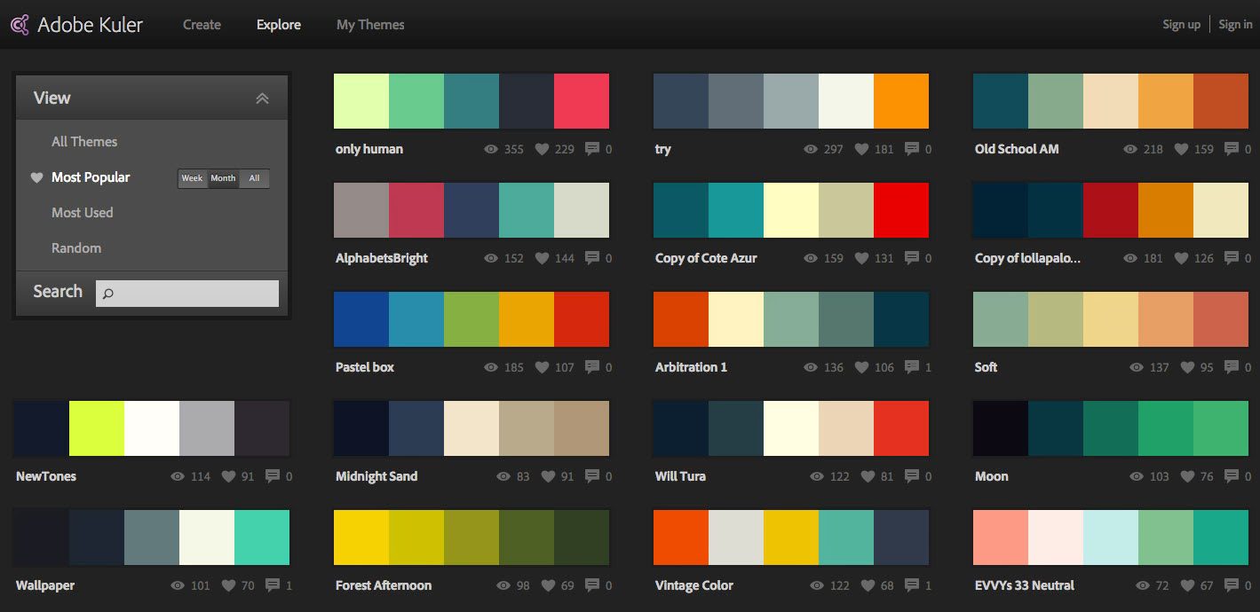
If you want to see a large selection of color pallets like above, go to https://kuler.adobe.com Click on Explore to see all types of themes, and they will even let you sort them from the most popular.
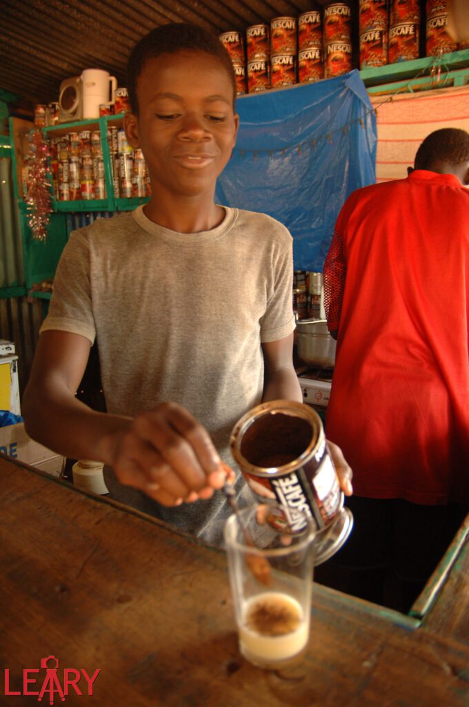
Traveling worldwide, I find specific locations with a more consistent color pallet, as in this photo from West Africa. I guess that when they make many of their clothes, they use the natural colors they can find, whereas, in the US, we import from all over the world, making things more eclectic.

In this scene above, it is like Hollywood coordinated the color pallet, but what is happening in Hollywood knows that they are just duplicating natural settings.
The most significant difference between what Hollywood is doing and what we might find in everyday life is being sure they control where the subject’s eyes go in a scene. For example, if one person walked into a set and was not part of the color pallet and everyone else was, then your eye goes to them immediately.

For example, the purple shirt is so different that your eye goes to that person.

In the photo of the two boys, they are both wearing blue, and the blue is also on the wall and the floor. Then you have the green and a touch of red in the boy’s pants, base, and flowers. So we have three colors in this photo that play off each other. Interior designers try to use three colors when decorating and what Hollywood does to help create a mood.
Sometimes you have to move a step to the right or left to recompose a photograph; that will help simplify the color pallet and make the photo stronger.
A color pallet is why going to the home of a family you plan to do a family portrait of and help pick out all the clothes and location before you show up later to do the shoot. If you do, you are managing the color pallet, which will make for a better photo.
The use of color is essential to the overall look of a project; like most other things, although the viewer may not be discussing the color palette after watching your work, you can rest assured that the color scheme – or lack thereof – most certainly affected their perception of it. For example, in big-budget Hollywood movies, a lot of attention is given to the color of even the finest detail, and with good reason!